
Remember me


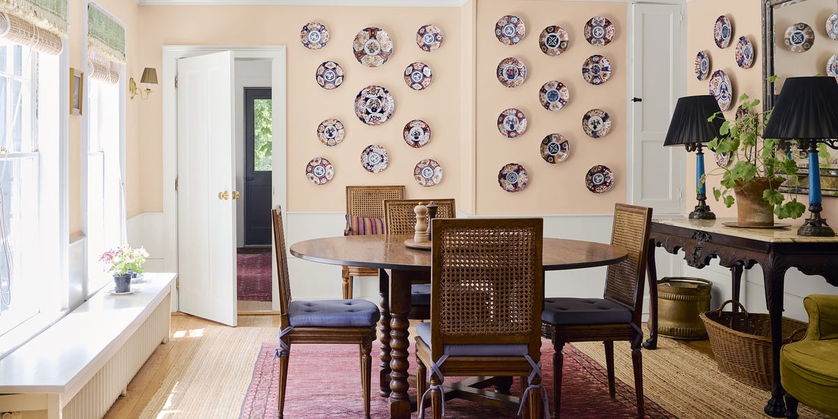
It’s been a decade since Millennial Pink took the world by storm, filling social media feeds and becoming a staple in interiors, beauty, and fashion. Now that the generation the iconic hue is named after is growing up, so is the color. Enter: Parisian Pink. A soft, muted shade of blush pink that feels like a more mature version of its millennial predecessor. It’s effortlessly chic, like it’s not trying too hard. And, it’s everywhere right now—from fashion runways and lip products to gracing the walls of cool girl Carolyn Bessette’s East Village apartment and Jackie O’s Upper East Side penthouse in Love Story: John F. Kennedy Jr. and Carolyn Bessette.
Parisian Pink proves you don’t have to be loud to make a statement. “If Millennial Pink was about expression, this version of blush is about restraint. It’s less about being noticed and more about how a space feels when you’re in it,” says Janelle Patton, the founder and principal designer of Lark Interiors. The color’s quiet confidence is graceful and grounded, yet fun and flirty. It’s this balance that makes the shade not just intriguing, but wildly versatile.
Arianna Barone, the color marketing manager at Benjamin Moore, says pink is an inherently flattering color, but this dusty, more muted hue has an added layer of versatility that makes it more livable. “It is a color that balances between playful and chic, so it can work in a variety of settings and styles,” Barone says.

Courtesy of Benjamin Moore
What’s more, Parisian Pink has an enduring quality that serves as a timely antidote to trend fatigue. “There is a timeless quality to dusty shades of pink, more so than the vibrant tints and shades this color family is also known for,” Barone shares. She explains that when used right, the subtle tone makes a room feel thoughtful and put together without it overwhelming the space. “It is a color that you won't tire of easily and not something that when you walk into the space, the first thing you realize is the walls are pink,” Barone adds.
In the midst of life’s constant noise, chaos, and clutter, Parisian Pink delivers more than just a splash of pretty color. Its calming softness feels like a moment of respite, something people are yearning for. “In a world that never stops buzzing, people are craving spaces that feel like a deep breath, and blush delivers exactly that,” says Stephanie Brown, the co-owner and principal designer at Saint Louise Design. For Patton, the color’s popularity is a reflection of where people are right now. “There’s less interest in making a bold statement and more interest in creating spaces that feel calm, settled, and personal,” the designer says. In her eyes, these muted blush tones bring warmth without heaviness, and soften a space without making it feel overly feminine or overly designed.

Courtesy of Benjamin Moore
The truth is that getting pink right is key—but not always easy. “Pink is a color that can go saccharine in the wrong lighting,” Barone says. If your space has cooler lighting, she recommends leaning into warmer pinks with more of a peach undertone, such as Love Story 1213 which is elegant and understated or Head Over Heels AF-250, a shade that’s as delicate as it is playful. If your lighting leans warmer, go with cooler hues like Foggy Morning 2106-70 that almost reads as a neutral or a dusty violet-pink shade like Batik AF-610.
As for how and where to incorporate Parisian Pink, Patton suggests treating it like a warm neutral. “The tones are softer, dustier, and more neutral-adjacent,” she says, adding that it’s not necessarily meant to stand out as “pink,” but to sit comfortably alongside warm woods, natural stone, and layered textiles. “It works beautifully with creams, browns, and even deeper tones like olive or navy—it adds just enough color to keep a space from feeling flat, but it still reads as timeless,” the designer says.

Courtesy of Benjamin Moore
Barone shares that overall, she’s seeing people opt for more color in their homes and dusty pinks are the perfect avenue. “Pink is a great option for bathrooms and bedrooms,” she reveals. Parisian Pink feels particularly well-suited for an intimate space like a bedroom—case in point: the now iconic “skin room” from this year’s adaptation of Wuthering Heights whose walls are covered in flesh-toned (literally!) blush pink from top to bottom. However, Barone says the color is also versatile enough for common areas, like living rooms, and would make for a stunning design statement in a kitchen. “A dusty pink could be beautiful on kitchen cabinets paired with lightly veined countertops and backsplash for a more refined look,” the paint expert says.
Whether your style leans more cool and contemporary or you’re all about a classic look, Parisian Pink is the chameleon that works with both. It’s grounded but doesn’t take itself too seriously, playful but not phony, subtle but makes a statement. All indicators that it came not just to play, but to stay.
 Retro Kitchens Are Making a Comeback
 Vintage Paint Colors Designers Are Loving
 IKEA's 2026 Color of the Year Is Rebel Pink
Maria Sabella is a lifestyle writer with a passion for home and interiors — from paint colors and holiday decor to the latest design trends. Her work has appeared in outlets including Better Homes & Gardens, The Spruce, BuzzFeed and Bustle.