
Remember me


Anyone launching a healthy snack brand has a mountain to climb. Consider this scenario: you've got a genuinely better product, made from pulses and grains instead of fried potatoes, baked, not fried, all the right credentials. You want to shout about it. But that's precisely why nobody's buying.
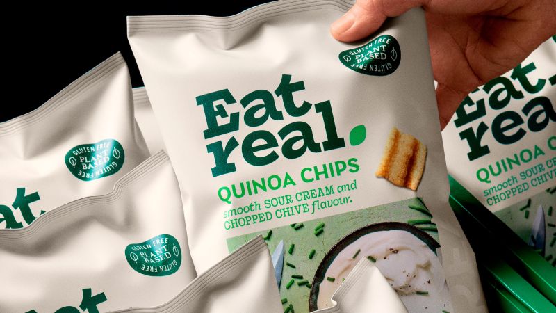
Eat Real found itself in this exact bind. Despite its point of difference—crisps made from hummus, quinoa, lentils, and vegetables—the brand was floundering. Low awareness. Inconsistent messaging. No clear moment of consumption.
The problem was that the more the brand talked about being healthy, the more consumers heard "worthy but dull". It's the snacking equivalent of being told vegetables are good for you. The statement might be true, but it's hardly motivating when you're standing in front of a shop at 3pm with a Twix in your peripheral vision.
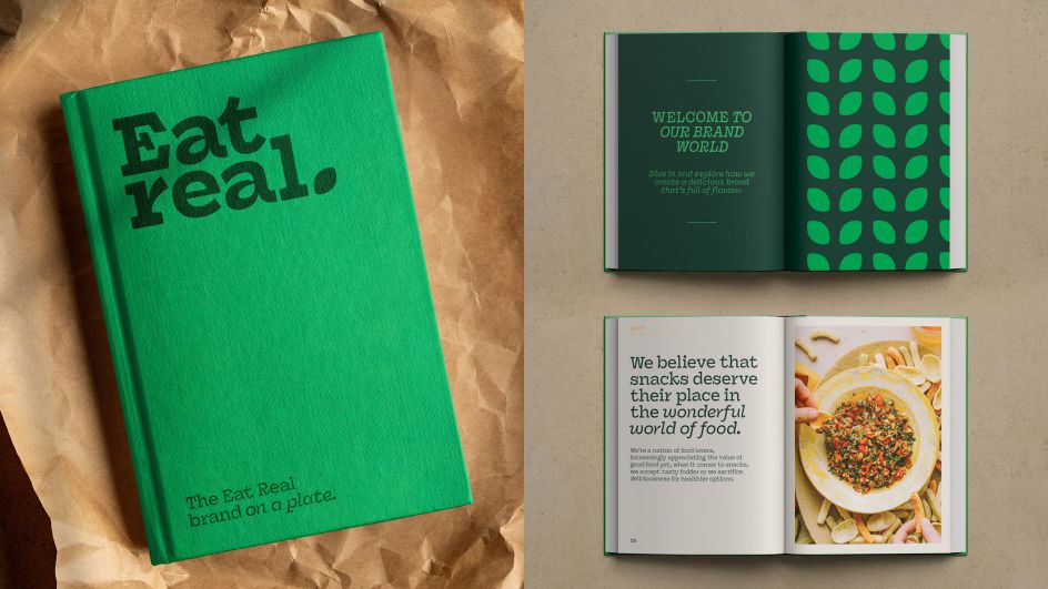
Selling taste, not healthLondon agency Midday Studio's solution was counterintuitive but brilliant: stop selling health, start selling taste. The rebrand pivots the entire positioning from wellness to deliciousness. And in doing so, it reveals a fundamental aspect of consumer psychology that designers working in food and drink need to understand.

The lesson: people don't want to be lectured when they're snacking. Consumers already feel guilty enough about snacking; they don't need a brand making them feel even worse. What they actually want is to enjoy themselves without the shame spiral.
In this light, frame your healthy snack as healthy, and you've just made it homework. Frame it as delicious, and suddenly it's a treat that happens to be better for you.
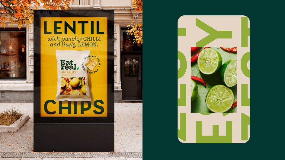
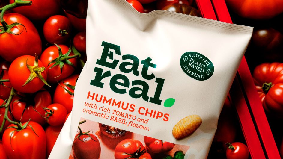
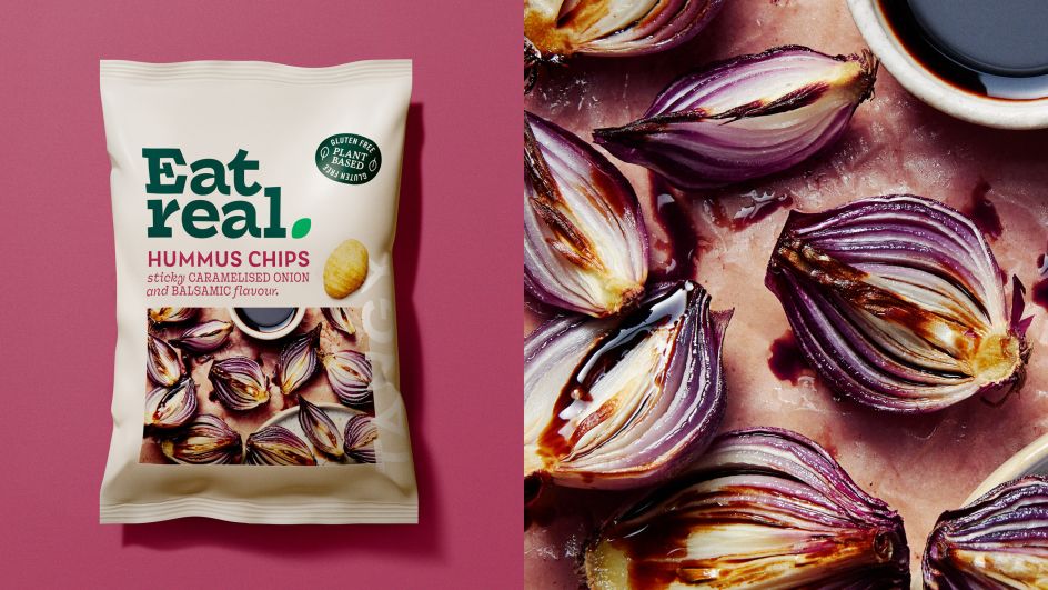
Cookbook inspirationThe design execution leans hard into this repositioning. Midday took inspiration from the world of cookbooks; those glossy, aspirational food bibles that make you want to cook even when you know you won't. It's a smart reference point because cookbooks are fundamentally about desire and sensory pleasure, not nutrition labels and calorie counts.
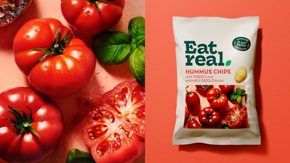
The packaging puts flavour front and centre with vibrant, food-focused colours and appetising photography of real ingredients; "freshly picked, imperfect yet beautiful vegetables and fruits," as Claudio Vecchio, creative partner at Midday Studio, calls them.
There's an abundance and naturalness to the imagery that communicates goodness without preaching about it. The tone of voice has got tastier too, with descriptors that sound like they belong on a restaurant menu rather than a dietician's recommendation.
Solving complexityImportantly, they also solved a practical problem. Eat Real's range is complex: four different chip bases (hummus, quinoa, lentil, veggie), each with multiple flavour profiles. The previous design wasn't helping consumers navigate this.
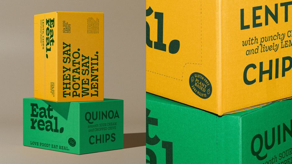
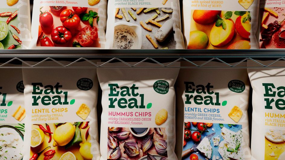
The new system creates a clear hierarchy and distinction while maintaining brand coherence. Midday evolved the dated elliptical holding shape from the old logo into a messaging roundel, freeing up the logotype to become more organic and modern, punctuated with a leaf. It retains just enough DNA from previous iterations to keep existing customers on board while signalling unmistakable change.
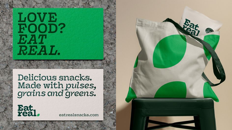
The refresh extends across every touchpoint (in-store displays, social media, sampling events) with the rallying cry "Love Food? Eat Real." It's an invitation, not an instruction. A celebration, not a sermon.
This kind of strategic bravery is surprisingly rare. Most brands cling to what they think should work rather than confronting what actually does. Eat Real could have doubled down on health messaging, added more certifications to the pack, emphasised protein content and low calories. Instead, they dared to make their hero a secondary benefit, or at least less explicit.
Key takeawayFor designers working on similar briefs in the better-for-you space, there's a crucial lesson here. Your clients will often want to lead with their virtuous credentials because that's what they're proud of, what differentiates them, what they believe in. Your job is to help them understand that consumers don't buy ingredient lists; they buy the promise of enjoyment. The health stuff can be there, but it needs to be a supporting actor, not the lead.
The snack aisle is hostile territory for challenger brands, dominated by big players with big budgets. To compete, you need to be as desirable as the worst-for-you option while being better for you. That's a tough brief. Midday's work shows how to pull it off: make people want it first, then feel good about it.
As for whether this repositioning works? Time will tell, but the strategic logic is sound. After all, we're a nation of food lovers who appreciate good food everywhere except, apparently, when it comes to snacks. Eat Real is betting that it doesn't have to be a compromise. And now it looks the part.
Comments (0)