Gilles Villeneuve
Gilles Villeneuve is one of Formula One’s most iconic figures. Not because of championships, but because he changed what racing looked like. His legacy is built on instinct and style rather than statistics.
Decades after his passing, Gilles’ presence lived mostly through archival footage and scattered memorabilia. Despite his stature, there was no unified visual identity capable of expressing who he was in a contemporary and coherentway. Especially for generations who never saw him race. The Villeneuve family didn’t want to preserve his memory, they wanted to carry it forward.
The challenge was to distill an instinct-driven figure into a symbol that could endure without sanitizing what made him legendary.
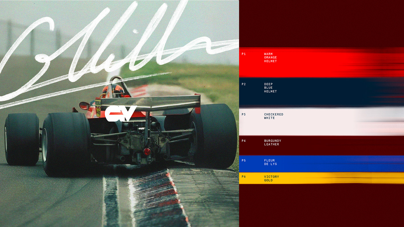
The starting point became Gilles’ helmet: a symbol made famous through his most iconic races, including his last. As recalled by his son Jacques, Gilles designed it himself in the family motorhome, getting it right the first time. No committees.
No revisions. Just intuition translated into form. Exactly like the way he drove. The logo had to carry that same instinct.
It combines Gilles Villeneuve’s initials, GV, into a monogram drawn from his helmet’s visual language. The V comes directly from the stylized chevron behind his helmet. The G is a sideways abstraction of a Formula One helmet. Where the two letters meet, their negative space forms the same arrow that appears on the sides of his helmet, embedding direction, speed, and forward motion into the mark itself.
The identity system expands this core mark into a larger lockup that also includes Gilles’ legendary Number 27 (synonymous in F1 with daredevil racing) and his original hand-drawn signature. The logo functions as a signature, bringing Gilles back into the present, allowing his story to continue through collections, collaborations, and fan experiences, ensuring his legacy isn’t over, but still unfolding


Comments (0)