
Remember me
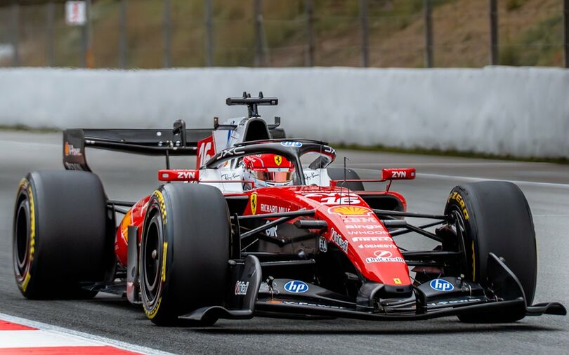


 F1 Grand Prix, GP Mexico, Autódromo Hermanos Rodriguez
Red Bull Racing has established one of the most recognisable visual identities in modern Formula 1, combining bold branding with a consistently evolving design philosophy.
Over the past two decades, the team’s livery has changed in response to aerodynamic trends, commercial partnerships, and shifting technical regulations. A comparison of the cars from 2005, 2011, 2014, 2021, 2025, and 2026 illustrates how Red Bull has refined its appearance while maintaining a clear and consistent brand identity.
2005: A Bold and Rebellious DebutRed Bull’s first Formula 1 car in 2005 introduced a vibrant and energetic design that reflected the company’s unconventional approach to motorsport. The livery featured a deep navy base, large Red Bull logos on the sidepod and engine cover, and additional branding such as Hangar 7.
The presence of Michelin tyre markings and the colourful layout created a lively and expressive look that matched the team’s disruptive arrival in the sport.
2011: The emergence of a championship identityBy 2011, Red Bull had become a dominant force in Formula 1, and the livery evolved into a more refined and cohesive design. The car displayed a cleaner navy finish, prominently positioned Red Bull branding, and distinctive purple accents introduced through the partnership with Infiniti.
Renault and Total logos were integrated into the layout in a balanced manner. This era established the classic Red Bull aesthetic, which included the dark blue base, the yellow nose, and the charging bull motif.
2014: Continuity Through the Hybrid TransitionThe 2014 livery maintained the visual identity that Red Bull had developed during its championship years. The design continued to feature Infiniti’s purple tones, Renault and Total sponsorship, and the familiar placement of the Red Bull logos.
Although the technical regulations changed dramatically with the introduction of hybrid power units, the team chose to preserve its established visual style, demonstrating confidence in its brand consistency.
2021: A Modern and Minimalist Interpretation
The 2021 car represented a significant refinement of Red Bull’s design language. The livery adopted a matte navy finish that created a sleek and modern appearance. Oracle became a prominent sponsor, and Honda logos appeared during the final year of the partnership.
Additional partners such as Mobil 1, Claro, Esso, Citrix, and Tezos contributed to a contemporary and angular visual style. This design marked the beginning of Red Bull’s current era, which blends heritage with modern presentation.
2025: A more sponsor focused layoutThe 2025 livery introduced a more sponsor dense arrangement that reflected Red Bull’s growing commercial strength. The matte navy base remained, while Oracle continued as the headline partner.
Honda branding was still present, and new sponsors such as Carlyle, Siemens, Player, and Rauch appeared on the car. The design maintained the team’s signature identity while adopting a more structured and corporate visual balance.
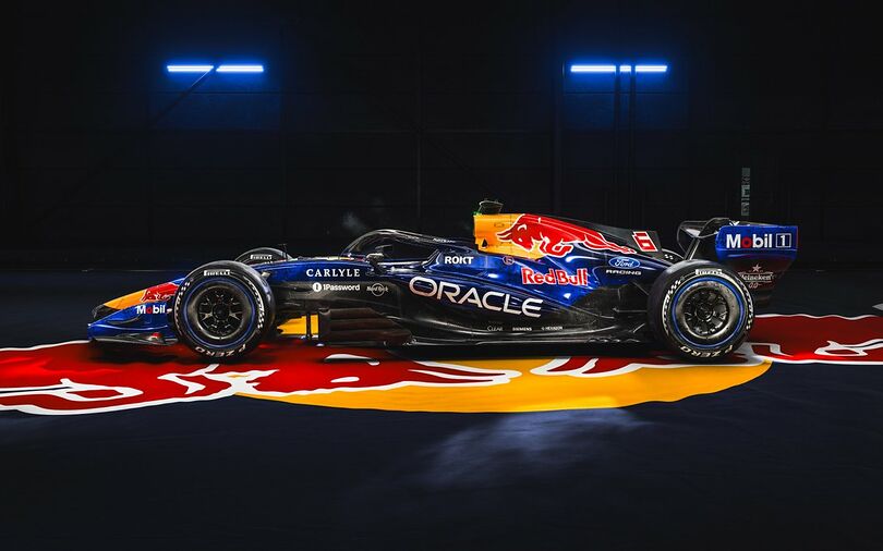
2026: A New Power Unit Partner with a Familiar LookThe 2026 livery marks the beginning of Red Bull’s partnership with Ford, and the branding changes reflected this shift. The car retained the team’s established visual identity while incorporating Ford logos in place of Honda. The sponsor layout became slightly cleaner, and Oracle continued to feature prominently.
Despite the major technical overhaul associated with the 2026 regulations, Red Bull chose to maintain continuity in its visual presentation, reinforcing the strength of its long standing brand elements.

Comments (0)