
Remember me
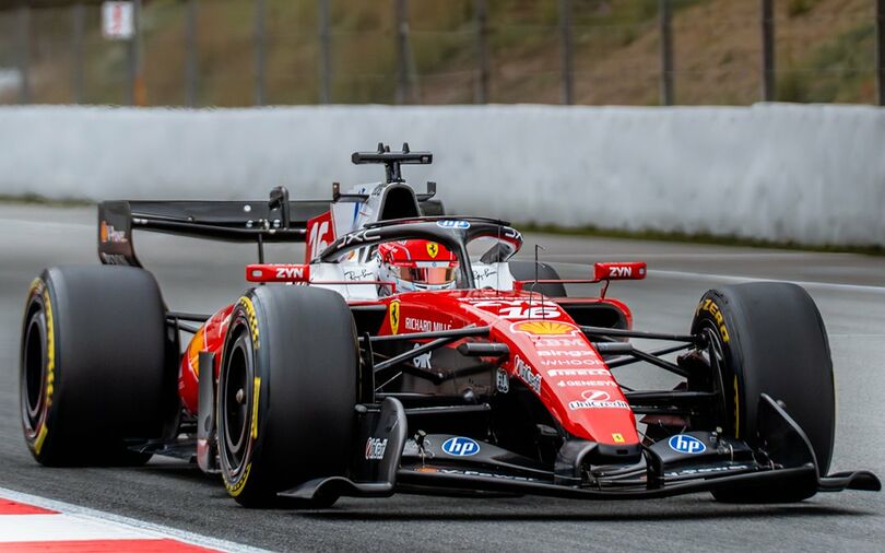


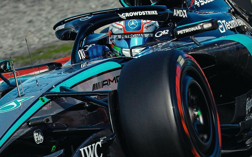
 F1 Grand Prix, GP Mexico, Autódromo Hermanos Rodriguez
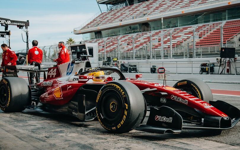
Over its first decade in Formula One, Haas has undergone one of the most visually varied journeys on the grid. F1Technical's senior writer Balazs Szabo takes a look at how Haas modified its liveries over the past seasons.
From its clean white debut to bold experiments in black and gold, and finally to the sharper, more mature identity of the mid‑2020s, the team’s liveries tell a story of shifting partnerships, technical eras, and a growing sense of self‑confidence. The progression from 2016 to 2026 reveals not only aesthetic changes but the evolution of Haas as a racing organisation.
2016 – The Clean DebutHaas’ inaugural livery set the tone for a new American team entering the sport with purpose. The 2016 car featured a predominantly white body accented with red and grey, a simple and modern look that reflected the team’s fresh start. The number 21 stood out clearly on the sidepod, and the overall design leaned toward clarity and restraint — a newcomer making a professional first impression.
2017 – A Darker, More Aggressive IdentityJust one year later, Haas pivoted dramatically. The 2017 car adopted a darker palette, dominated by deep grey with white and red detailing. The “MAG” marking on the rear wing added a personal touch, and the car’s overall tone felt more assertive. It was a visual signal that Haas was no longer simply arriving — it was establishing itself.
2019 – The Black‑and‑Gold ExperimentThe 2019 livery remains one of the most striking in Haas’ history. The team embraced a bold black base with gold accents, accompanied by prominent branding from partners such as Richard Mille and BlueDEF.
The number 20 sat sharply against the dark background. This livery represented Haas’ most dramatic departure from its original identity, reflecting a season defined by ambition and risk.
2022 – A Return to White with a Modern EdgeThe 2022 car marked a return to a predominantly white design, but with a more contemporary execution. Red and black accents created a crisp, aerodynamic look, while sponsors like 1&1 and MoneyGram added strong visual anchors.
The number 20 remained a familiar element, but the overall aesthetic felt cleaner and more refined — a reset after turbulent seasons.
2025 – Sharper Lines and a More Cohesive BrandBy 2025, Haas had settled into a confident visual language. The livery combined white with black and red in a balanced, structured layout. Sponsors such as Zoomex, Orion180, and MoneyGram were integrated more seamlessly than in earlier years, giving the car a polished, professional appearance. The design reflected a team that had matured both commercially and competitively.
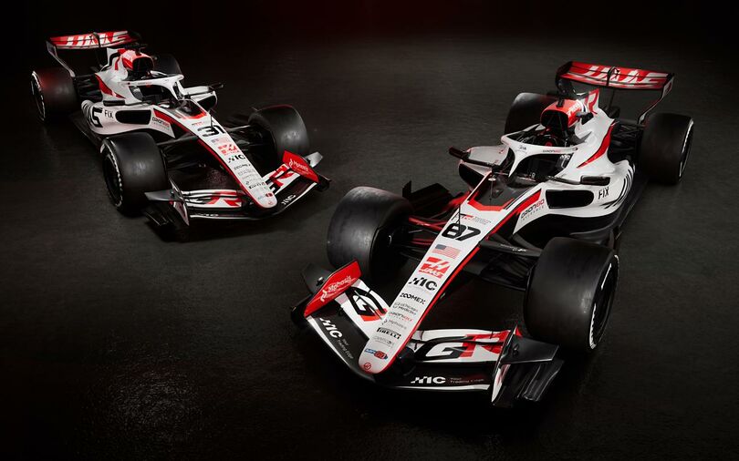
2026 – A New Era, A New LookThe 2026 livery continues the white‑red‑black theme but introduces a more futuristic, regulation‑era‑appropriate aesthetic. Updated branding — including GR, FIX, and Singha — appears across the bodywork, and the car’s proportions reflect the new chassis rules.
The design feels sharper and more purposeful, aligning with the team’s technical reset and the sport’s broader shift toward hybrid‑heavy performance.

Comments (0)