
Remember me


The year is coming to a close on another incredible year of action-packed esports events. So it’s time to break down what everyone ACTUALLY cares about: the fits.
So before we get hit with a wave of 2026 jersey announcements, let’s take a look back at this (not-so) definitive tier list of 2025 esports jerseys. Be ready: most of these jerseys are very plain shirts with a collar and a logo slapped on it, which has left me feeling a bit uninspired about jerseys this year.
A lesson to esports teams: embrace who you are, celebrate your fans, and stop trying to be something you’re not: a soccer team.
S-Tier: I would wear this as everyday attire Paper Rex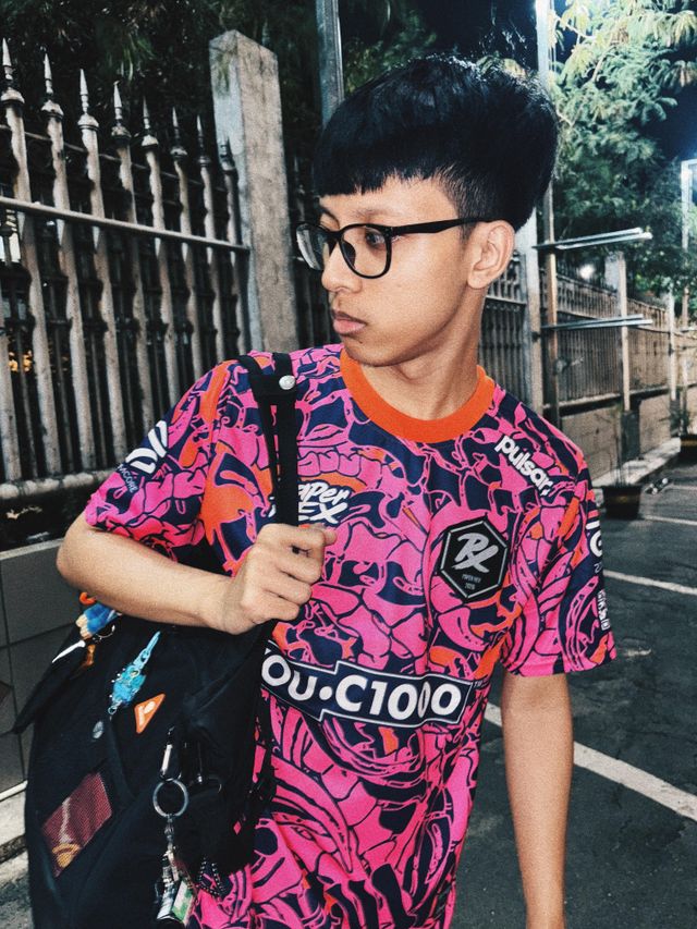 Image Credit: Paper Rex
Dinosaurs? Yes please. It is rare to find a brand in esports that transcends the industry. While many esports jerseys have adopted the style of basic knock-off football jerseys, Paper Rex has continued to innovate with their iconic pink and purple dinosaur designs.
Not saying they just slapped t-rex and triceratops all over it like the boy’s section at Walmart. It’s somehow tasteful, using claws and other fossil components to create a flowing and bold design. The fact that I have seen fans of traditional sports rocking these babies in the stands is a testament to its brilliance.
A-Tier: I would wear this to an esports event G2 Esports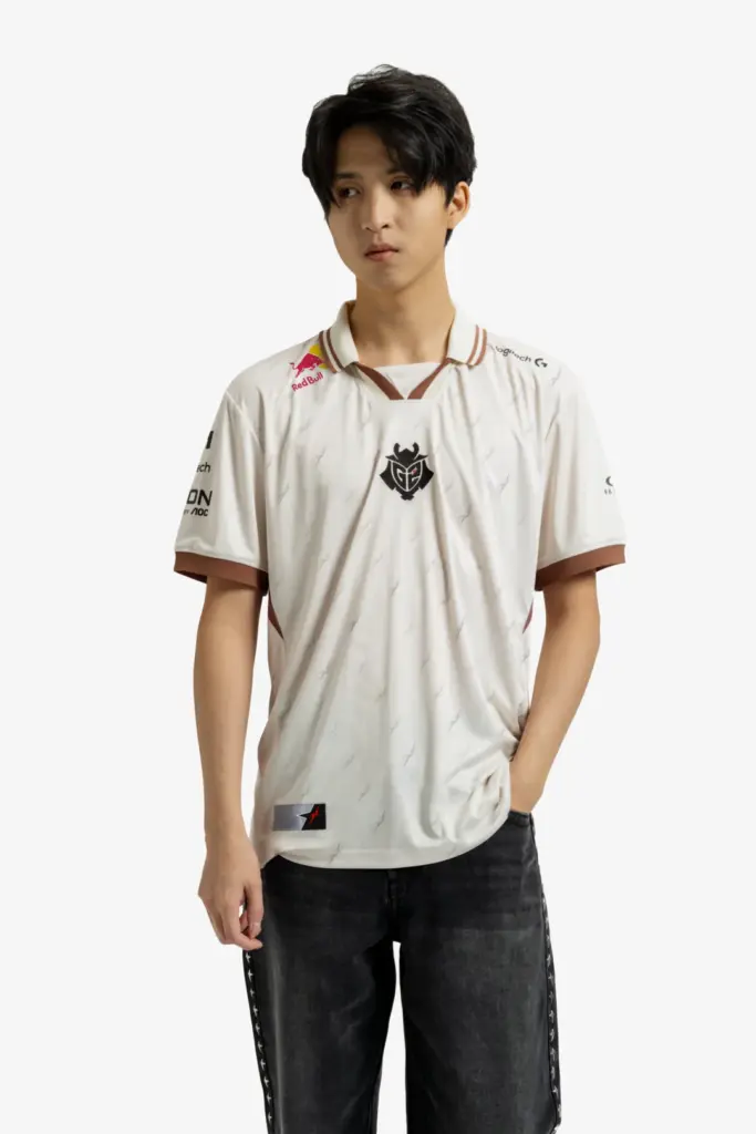 Image Credit: G2 Esports
G2 recently shared its 2026 collection, which attempts to be a bit more flattering with its contouring line along the sides. However, G2’s 2025 cream colored jerseys are pretty clean. G2 shows that the collar can really work if executed well. This jersey doesn’t feel overly obnoxious or branded, finding ways to show off their sponsor logos while keeping the design elevated.
I like the cream and light brown combo, and the ninja star accents are the perfect accent to give a little texture to the design. Still, not sure if I’d want to wear this quasi-nerdy design outside of an event with other equally nerdy people.
LOUD Image Credit: LOUD
Yeah, that’s hot. I’d wear it. The textured look is great, the uniform looks good on the players when they wear it, and I love that abstract, almost snake-like element that curls around the uniform, unifying the back and the front.
The various greens and the flowy tail design snaking around the body come together to create a cohesive look that will definitely make you look like the coolest person at an esports tournament. But yeah, at an esports tournament.
Team Liquid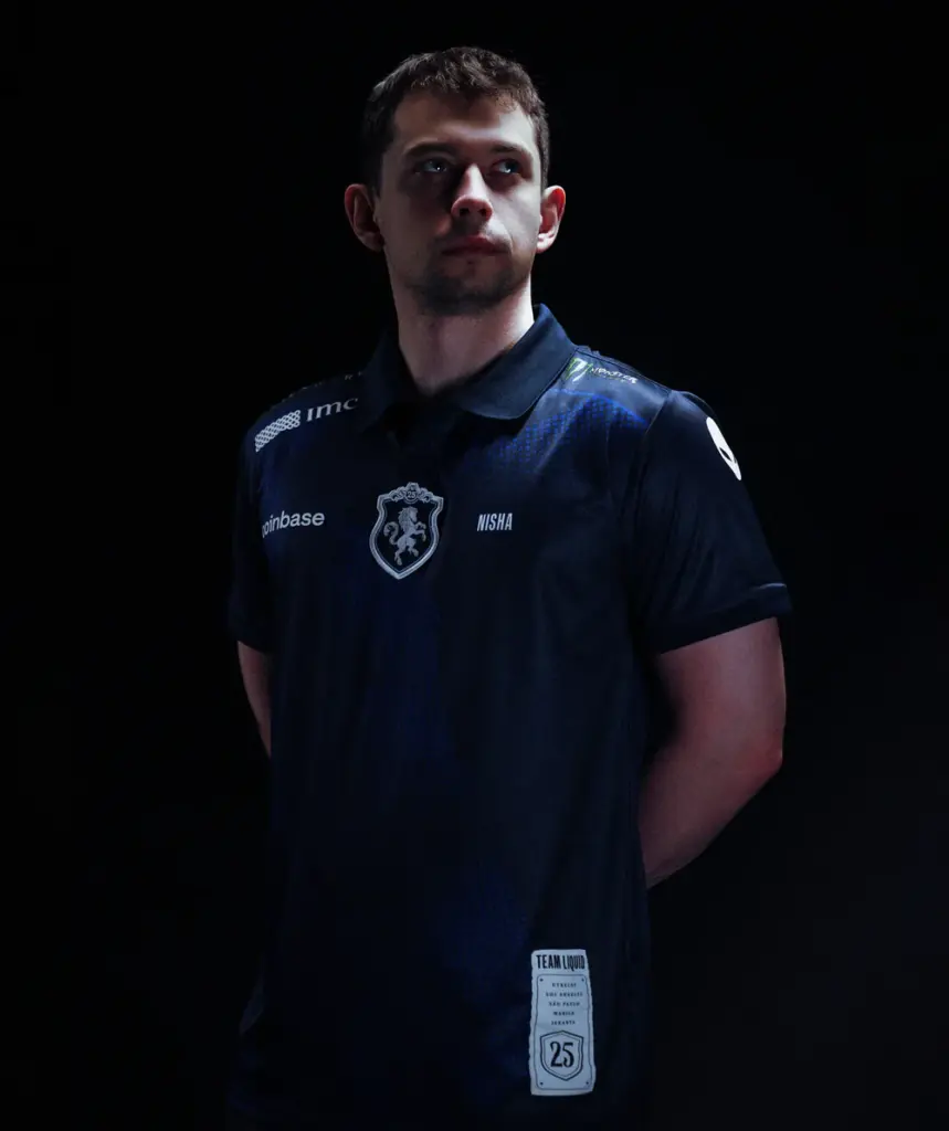 Image Credit: Team Liquid
Team Liquid has an S-Tier logo, but their uniforms rarely live up to it. But this year they did. I really like this subtle patterning, and the centered badge featuring what looks like a Team Liquid coat of arms. This is actually pretty sick, not gonna lie.
I know it’s under the “esports event only” area, but I could see myself wearing this at a Dungeons & Dragons one-shot as well. If that means anything.
B-Tier: I would wear this around the house 100 Thieves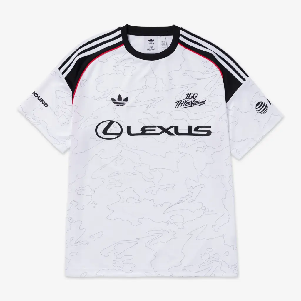 Image Credit: 100 Thieves
100T took the L on their 2023 jersey, producing a boring and basic design that resembled a polo more than a jersey in some respects. This year, they played it safe with an Adidas core vibe, with a white and black primary color, just a hint of red, and that squiggly accent texture.
At this point, I’m unsure if 100 Thieves is willing to go beyond this boring comfort zone. It’s obviously not the most hideous thing I’ve seen, but it feels more like something I’d wear while lounging around the house unless I felt like blending in with football fans in Europe for some undercover mission or something.
Gentle Mates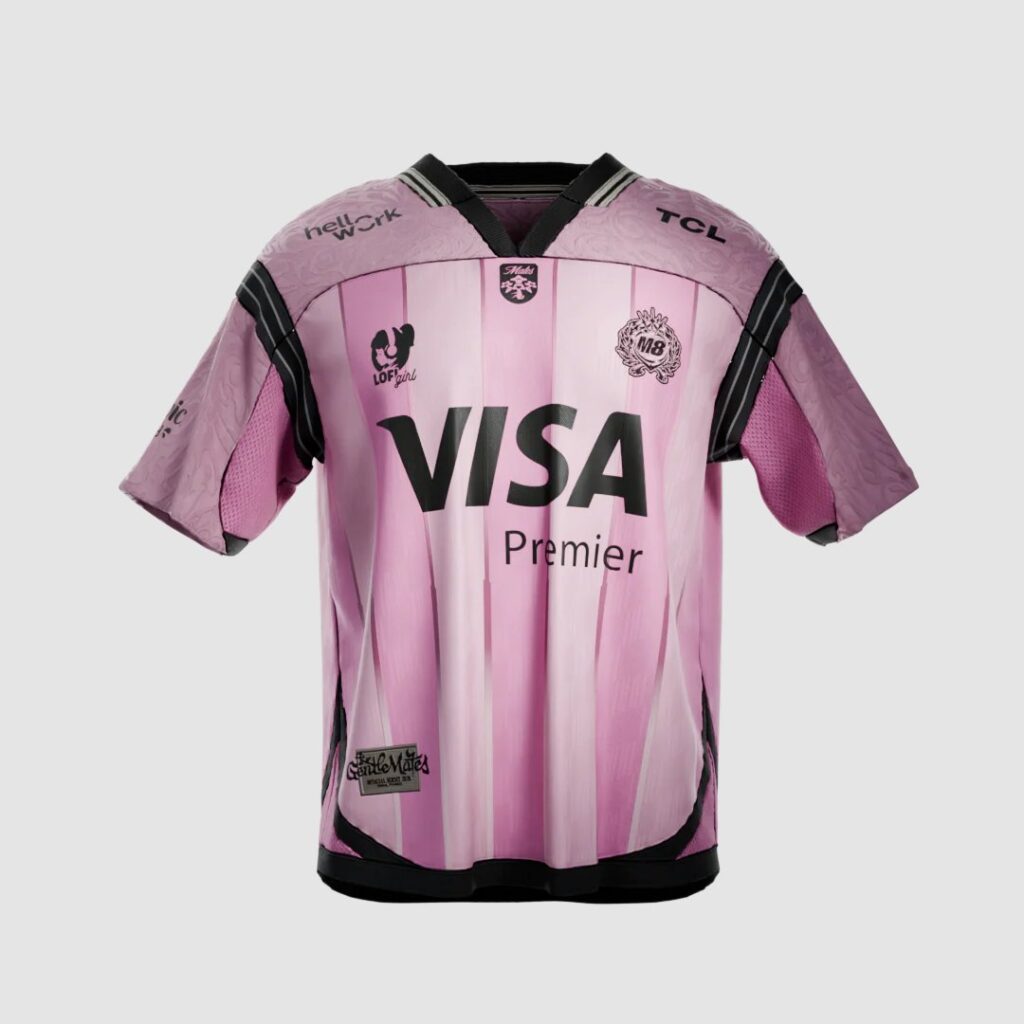 Image Credit: Gentle Mates
Gentle Mates has a great brand in general, but the 2025 jersey was just okay. While I appreciate the subtle design elements and textures, such as the birds and the ornamentation in the center, the large VISA logo (which is significantly larger than their own logo) feels off to me and detracts from the overall design.
There are a lot of good ideas here, but I don’t like feeling like I’m schilling VISA rather than the team. It’s so goofy and oversized, in fact, that I almost wouldn’t even want my sugar gliders in this fit lest they think me a corporate sellout.
KRU Esports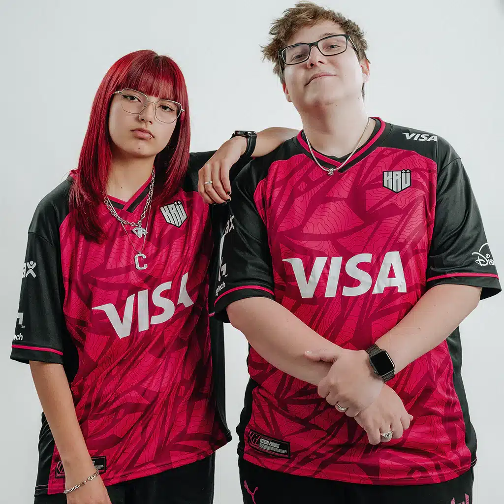 Image Credit: KRU Esports
KRU Esports is in a very similar situation to Gentle Mates. I love their brand, they have great jerseys, and this shattered look is actually pretty sick. But I gotta downgrade them because that VISA logo is fucking huge.
Asking for a friend, are you KRU or are you VISA? I just can’t bring myself to pay $80 for a shirt dedicated to a credit card company.
T1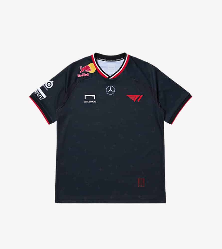 Image Credit: T1
T1 stuck to their guns with a very standard black design with some subtle cross details. It’s very clean, it’s very boring. It’s as safe as Faker’s answers during a press conference.
It’s unfortunate since their other merch is actually pretty fresh and street-forward. But the jersey is getting stuffed into the closet until I need something comfortable and sweat-free to wear while I play chess online.
At least I can try to embody that Worlds-winning attitude, which is hopefully hidden somewhere within the stitches. It’s clearly not on the design itself.
C-Tier: I would wear it if I got it free OpTic Gaming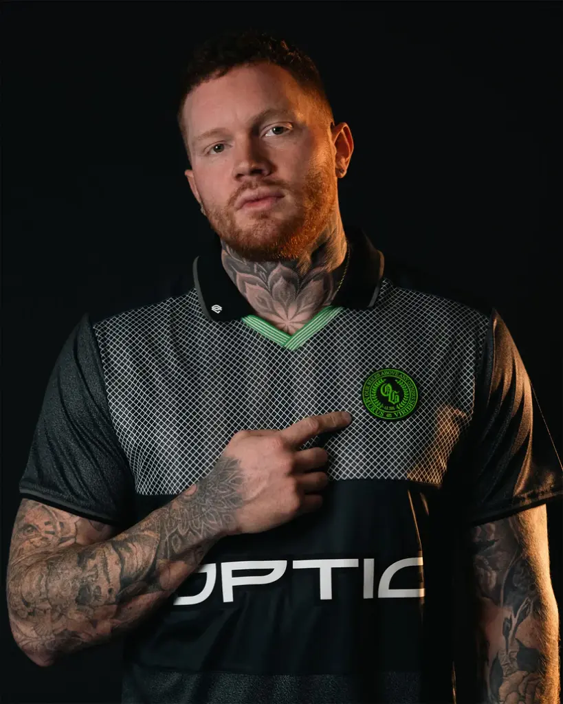 Image Credit: OpTic Gaming
In 2025, OpTic went with a collared uniform, where the chest is a cross-hatch texture while the rest is a mix of black and charcoal grey. There is a big flaw here — they used only a tiny bit of green on this uniform. For a team whose motto is “green wall” where is the green? Come on, guys.
While the T1 uniform can make you feel like you’re about to win Worlds, OpTic’s can definitely make you feel like you’re about to take second at the Microsoft Excel World Championship. Their model tried to make it look cool, but it’s def giving, “Are you going to collect the homework” vibes.
D-Tier: I ain’t wearing that FaZe Clan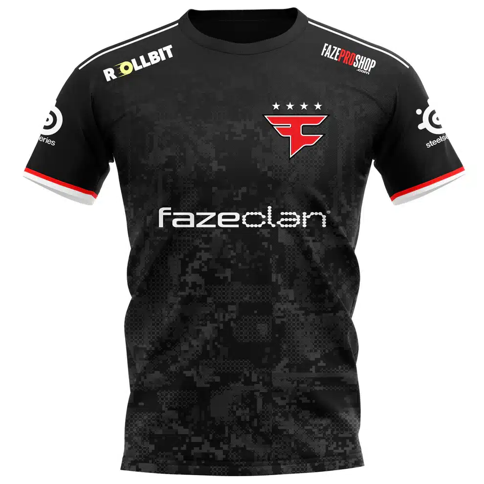 Image Credit: FaZe Clan
You Faze logo slap a shirt that looks like it’s been drug under an old dusty bed, and bam, you got the Faze Clan official 2025 jersey. This is uninspired, luckily when it collects dust in your closet the dust will blend right in with the jersey design itself.
If you want to look like a crypto bro that watches people pretend to win money on Kick gambling streams, this is the jersey for you.
MIBR Image Credit: MIBR
MiBR has a rather basic brand, and that showed in 2025 with these striped and collared uniforms. However, these jerseys make the big VISA jerseys from earlier look stylish.
I’d never be caught dead wearing a jersey dedicated to esports betting. While 1XBET takes up the entirety of the front of the jersey (and the left shoulder), you can barely see the actual esports team logo anywhere.
And no, I’d not even wear this to a Dungeons & Dragons one-shot.
The Escapist is supported by our audience. When you purchase through links on our site, we may earn a small affiliate commission. Learn more about our Affiliate Policy