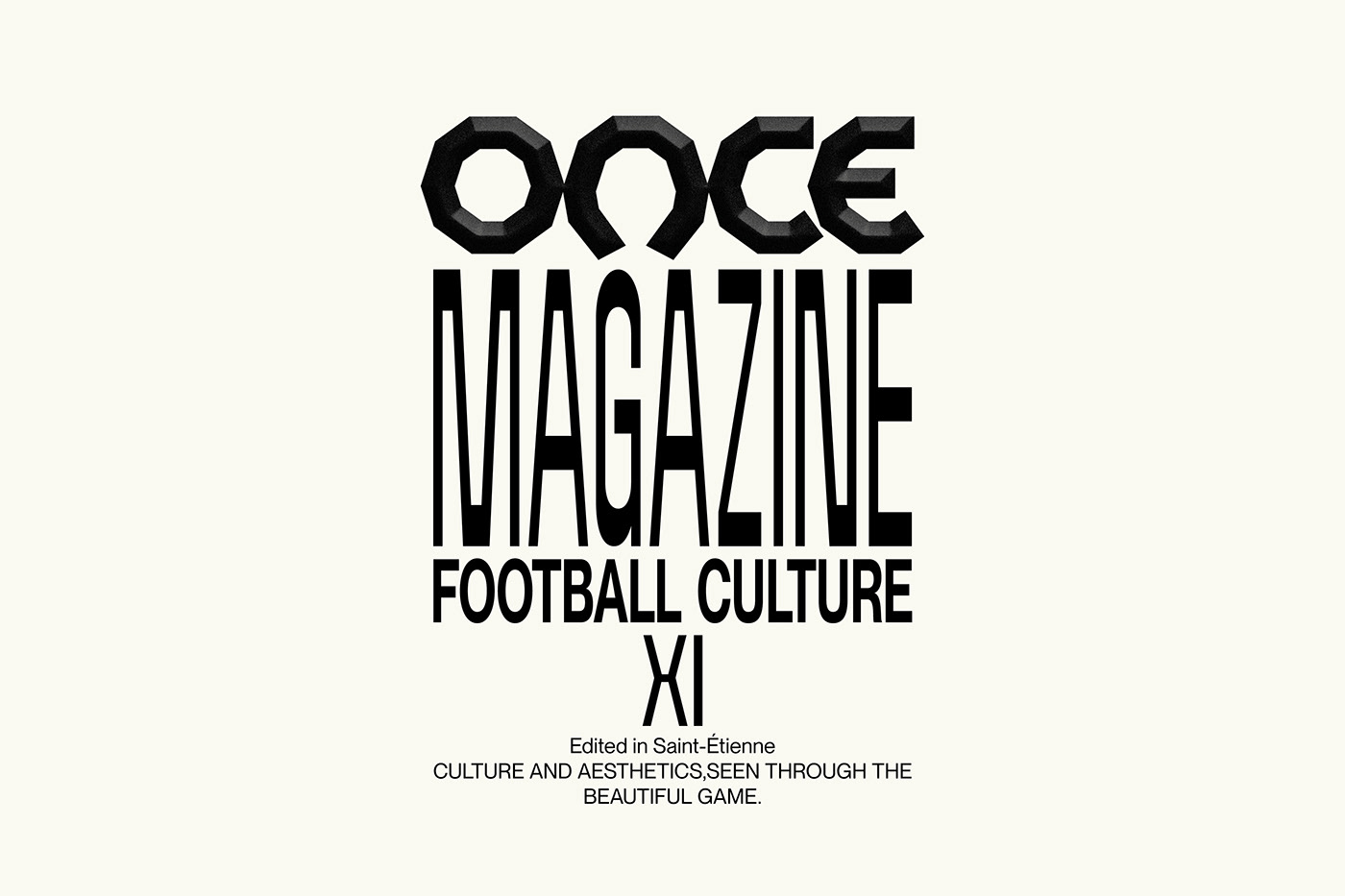
ONCE Magazine
ONCE
As a true football fan, I genuinely enjoyed designing this project.
ONCE is a magazine built around eleven articles exploring football culture through aesthetics, fashion and visual narratives.
The identity takes direct inspiration from the geometric construction of the ball, specifically the pentagons and hexagons that from its surface. These angular shapes were translated into a bold, modular logotype where each letter functions as both typography and shape, allowing the system to expand into dynamic graphic compositions across different formats.
Taking cues from the center of the pitch, the cover uses its natural symmetry as a starting point. It remains clean and focused, letting the structure speak without unnecessary noise.
Built as a flexible system, the identity is meant to move and adapt. It can live across future editions, live on jerseys, and interact with elements intrinsic to the sport itself. In doing so, it celebrates football not only as a game, but as a design-driven cultural expression.
Brand Identity / Visual Identity / Logo design / Art direction / Editorial design

Comments (0)