
Remember me


Summary: In an era of AI-generated-everything, AI-fatigued users want designs that look like they were made by a person.
People are buying vinyl, dusting off their wired headphones, shooting on film, and opting for things that are slower. Digital fatigue and AI fatigue are changing what resonates, and audiences are gravitating towards designs that look handmade.
The Shift to Handmade DesignsDesign trends swing back and forth like a pendulum. New trends emerge in response to whatever is mainstream at the time. In the early days of the web, skeuomorphism was everywhere, and we saw detailed interfaces that mimicked the physical world. Then, the pendulum swung in the opposite direction, and flat design took over, with no shadows and no ornamentation. Flat design was a direct response to all the visual noise that came with skeuomorphism.
Now, many people are tired of overly polished, gauzy, AI-generated visuals that look good from afar but fall apart in the details. When anyone can generate a sleek image in minutes, polish stops being a quality signal. Audiences are starting to ask whether a person cared enough to design it themselves.
What comes after "handmade"?If you look at brand campaigns, websites, and packaging from the past few years, you’ll notice hand-drawn illustrations, sketches, and paper-grain textures everywhere. The pendulum is swinging toward designs that look messier, more genuine, authentic, and handmade.
What Does Handmade Look Like?Handmade is an umbrella term that includes many visual styles like linocut illustrations, naive design, risograph, watercolor, and hand-lettered type, with the wabi-sabi mindset of embracing imperfection.
Wabi-sabi refers to a Japanese aesthetic philosophy that values the beauty found in imperfection, impermanence, and authenticity. In design, it embraces features like uneven lines, organic shapes, visible textures, and the sense that something was made by hand rather than by machine.
These visual styles share certain traits: line weights that vary, shapes that don't quite close, visible brushstrokes, handwritten typefaces, and various textures. Nothing is perfectly centered. Nothing is perfectly smooth. These are the signals that a human made the work by hand and that there's intention and attention behind it.
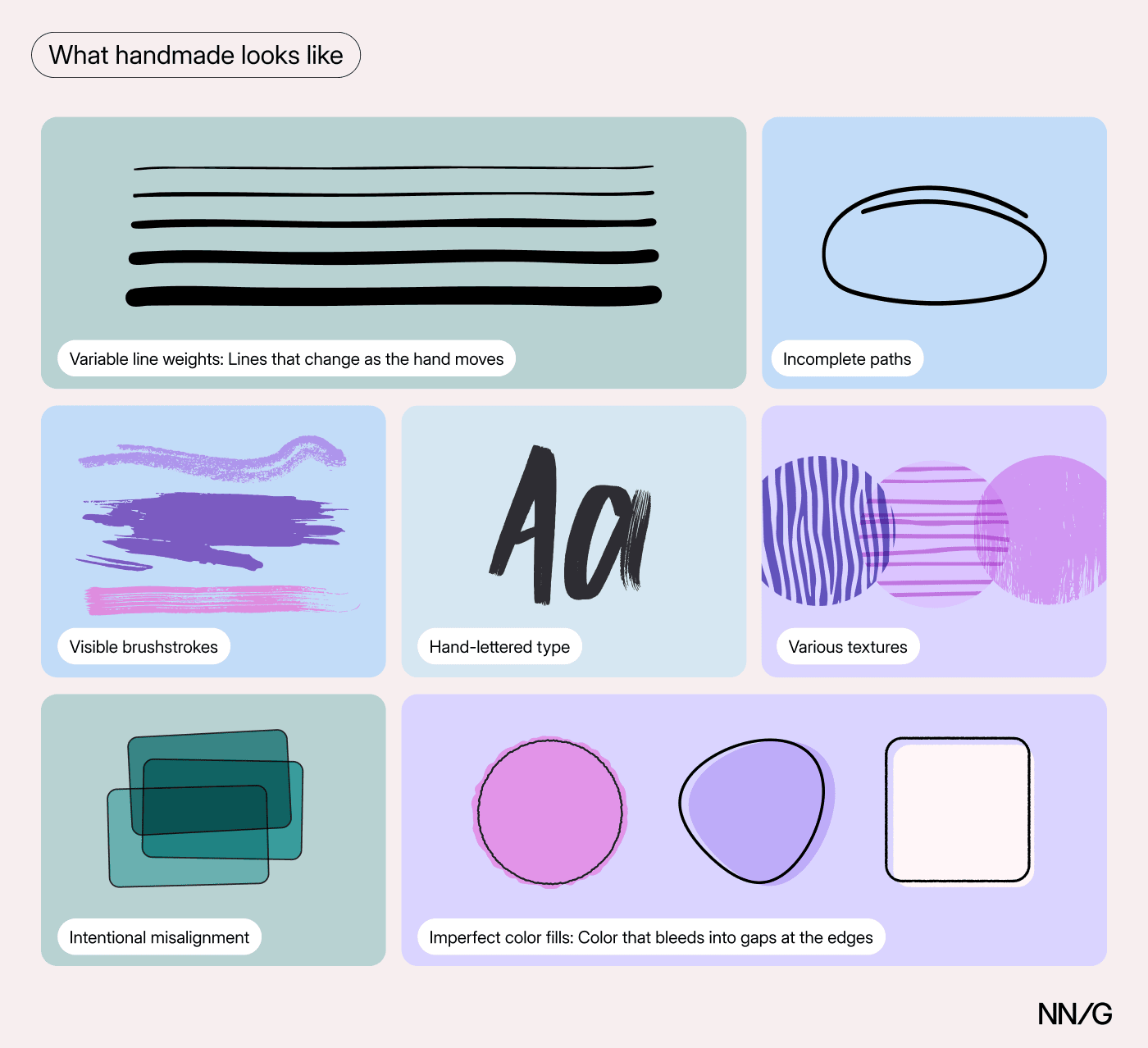 Handmade design characteristics include variable line weights, incomplete paths, visible brushstrokes, hand-lettered type, texture, misalignment, and imperfect color fills.
While AI-generated images aren't always clean and perfect either, their imperfections feel different. A human error is a small mistake in execution, like a shape that's slightly off, or a line that doesn't quite close. An AI error is a hallucination, something that looks wrong in a way that's random and disorienting when you notice it.
AI image generation is improving quickly, though, and that's why this style works even better when it's paired with a story. In the examples below, you’ll notice that the aesthetic is often paired with public emphasis on the human beings who partnered with each brand to create it. These were clearly intentional marketing choices meant to highlight that the images are not AI.
Examples of the Digital Handmade StyleThere are many ways to incorporate this look and feel into a brand. Whether it resonates depends on the brand and what it's trying to communicate. A few brands are doing this particularly well.
Hermès Homepage 2026Artists have always played a central role in shaping Hermès’s brand identity. Since 1937, every silk Carré scarf has been designed by a named artist. The company’s 2026 website redesign reinforces this long-standing tradition, reminding audiences of what sets Hermès apart: its products start with a human artist.
To bring this idea to life, Hermès commissioned French illustrator Linda Merad to redesign its official website. She created twelve hand-drawn illustrations inspired by linocut and lithographic print styles.
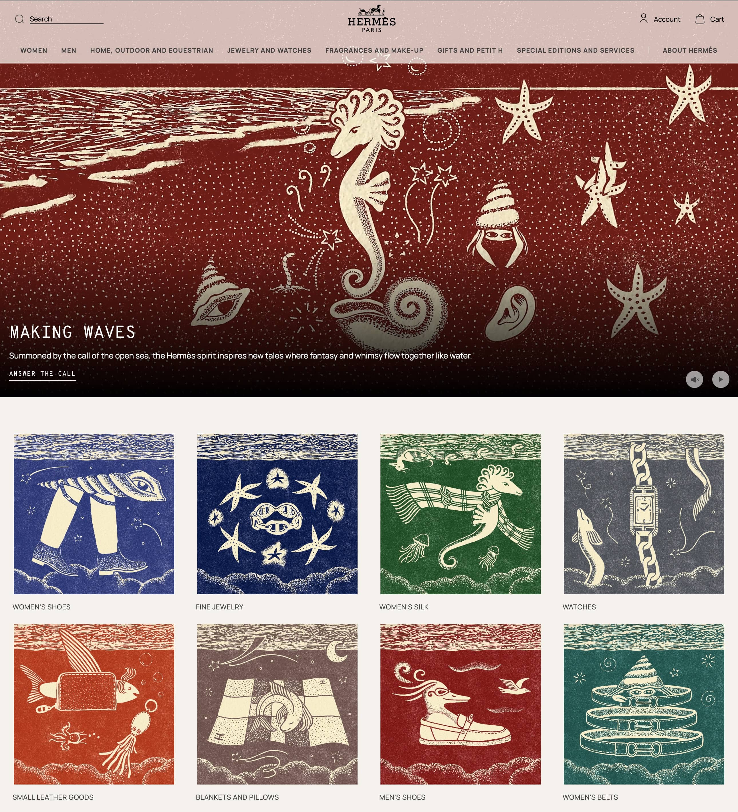 Illustrations by Linda Merad for Hermès 2026 homepage redesign.
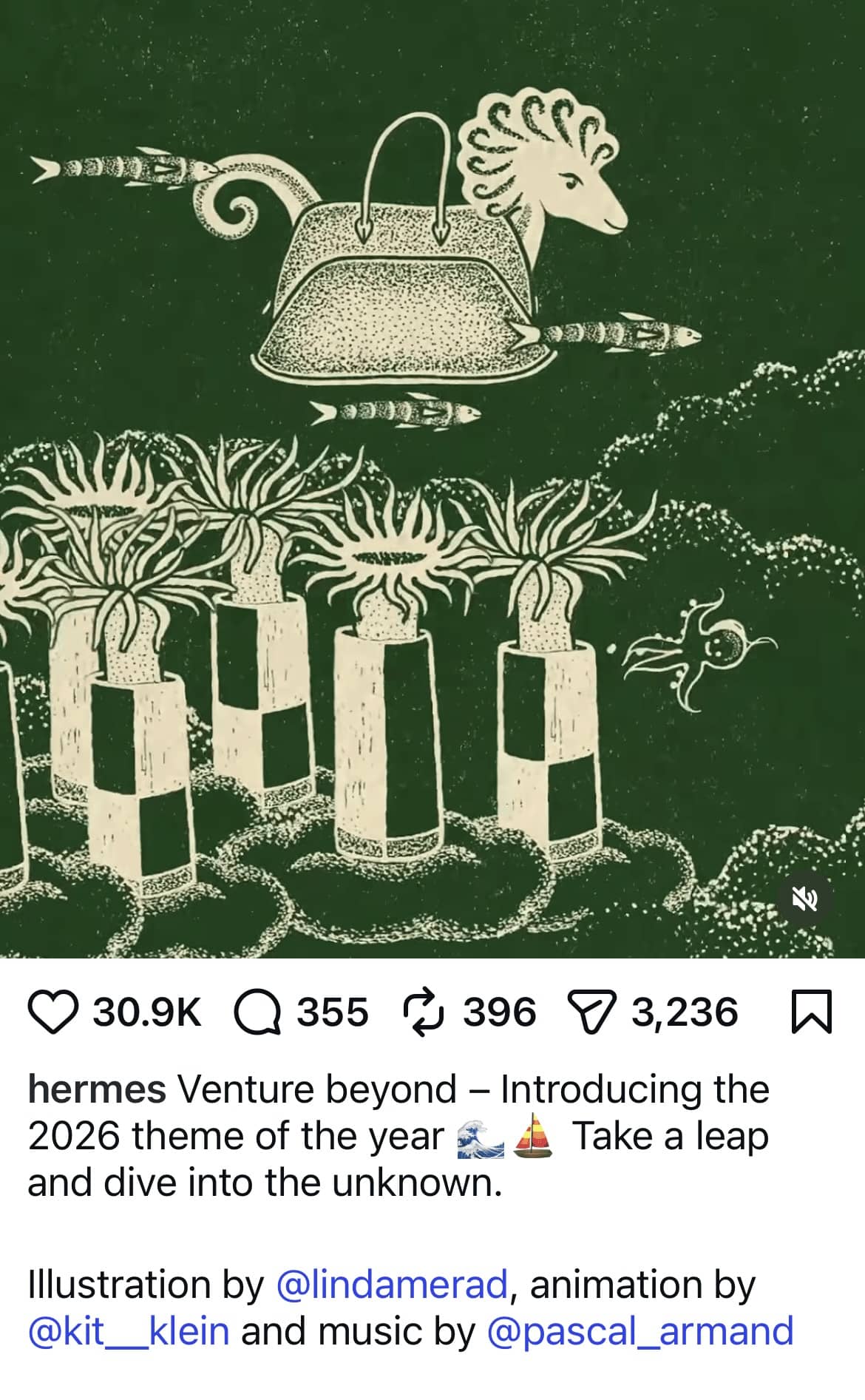 In all its promotions, Hermès clearly credited Linda Merad, the artist behind them.
Paris Olympics 2024
In all its promotions, Hermès clearly credited Linda Merad, the artist behind them.
Paris Olympics 2024
The Paris Olympics branding also leaned into handmade visuals. Olympic visual identities usually rely on editorial photography of athletes or iconic images of the hosting city. Paris chose a different route, commissioning French illustrator Ugo Gattoni to create its official posters instead.
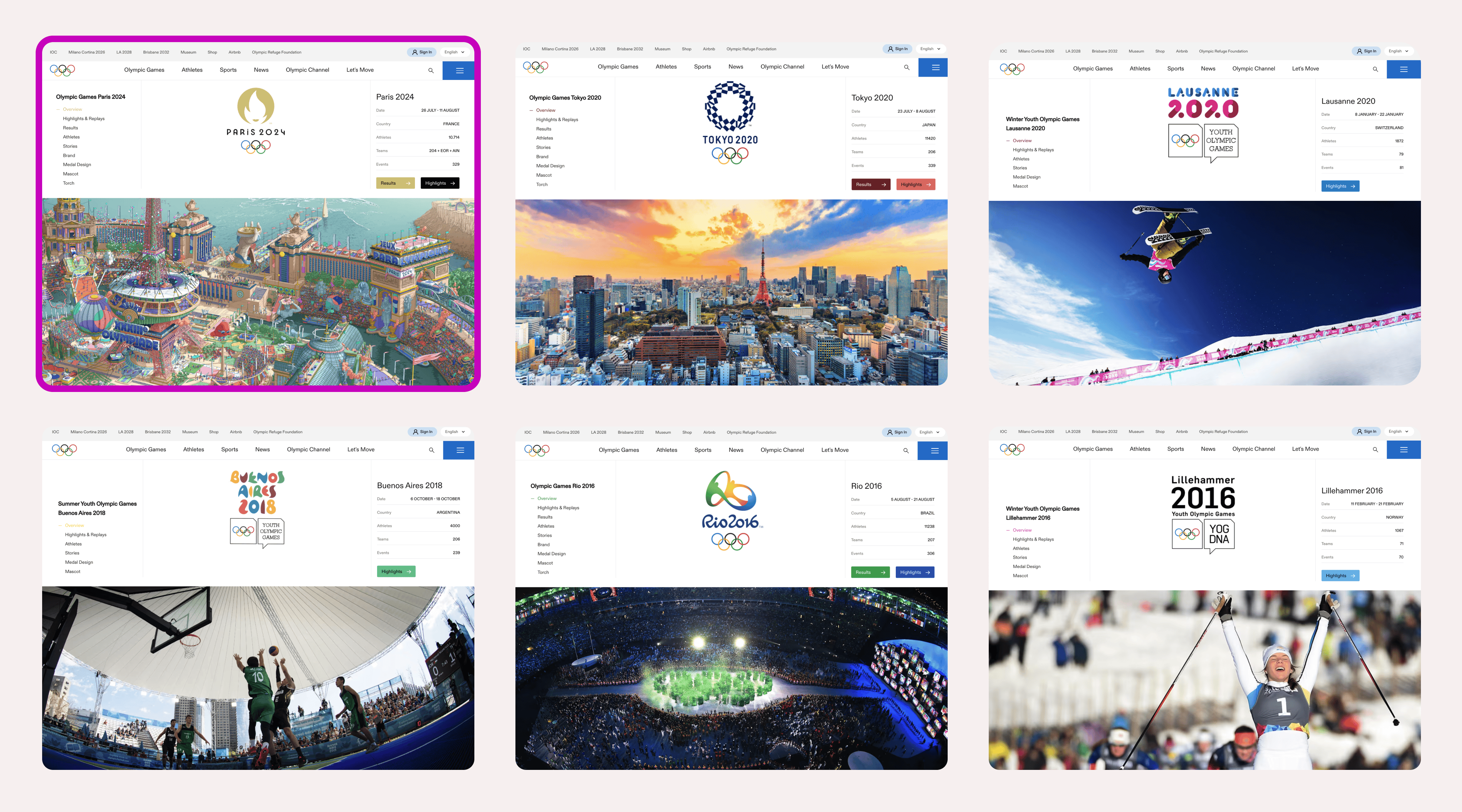 Paris Olympics homepage (top left) alongside homepages for Tokyo 2020, Lausanne 2020, Buenos Aires 2018, Rio 2016, and Lillehammer 2016
Gattoni specializes in creating panoramic scenes packed with hundreds of figures, landmarks, and tiny details you keep finding on a second or third look. His Olympic posters follow the same approach: intricate, hand-drawn compositions in his signature surrealist style.
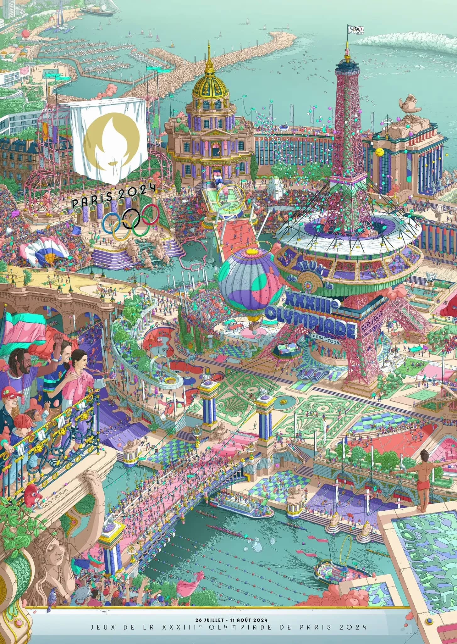 Paris 2024 Olympics poster by illustrator Ugo Gattoni
Just as important, the Paris Olympics emphasized the person behind the work. Gattoni creates entirely by hand, using digital tools only to scan and refine his drawings. Organizers highlighted both who was behind the illustrations and the scale of Gattoni’s effort: nearly 2,000 hours across 6 months.
That emphasis on authorship matters now more than ever. With the right prompting, an AI tool could theoretically replicate this style. What it cannot replicate is the human story behind the work. That story is what gives the final result its value and makes it irreplaceable.
Acne Studios Instagram 2025Acne Studios, a Swedish luxury fashion house, is known for its Scandinavian minimalism, with cool tones, desaturated photography, and restrained editorial aesthetic. That is why its recent collaboration with illustrator Michael McGregor stands out.
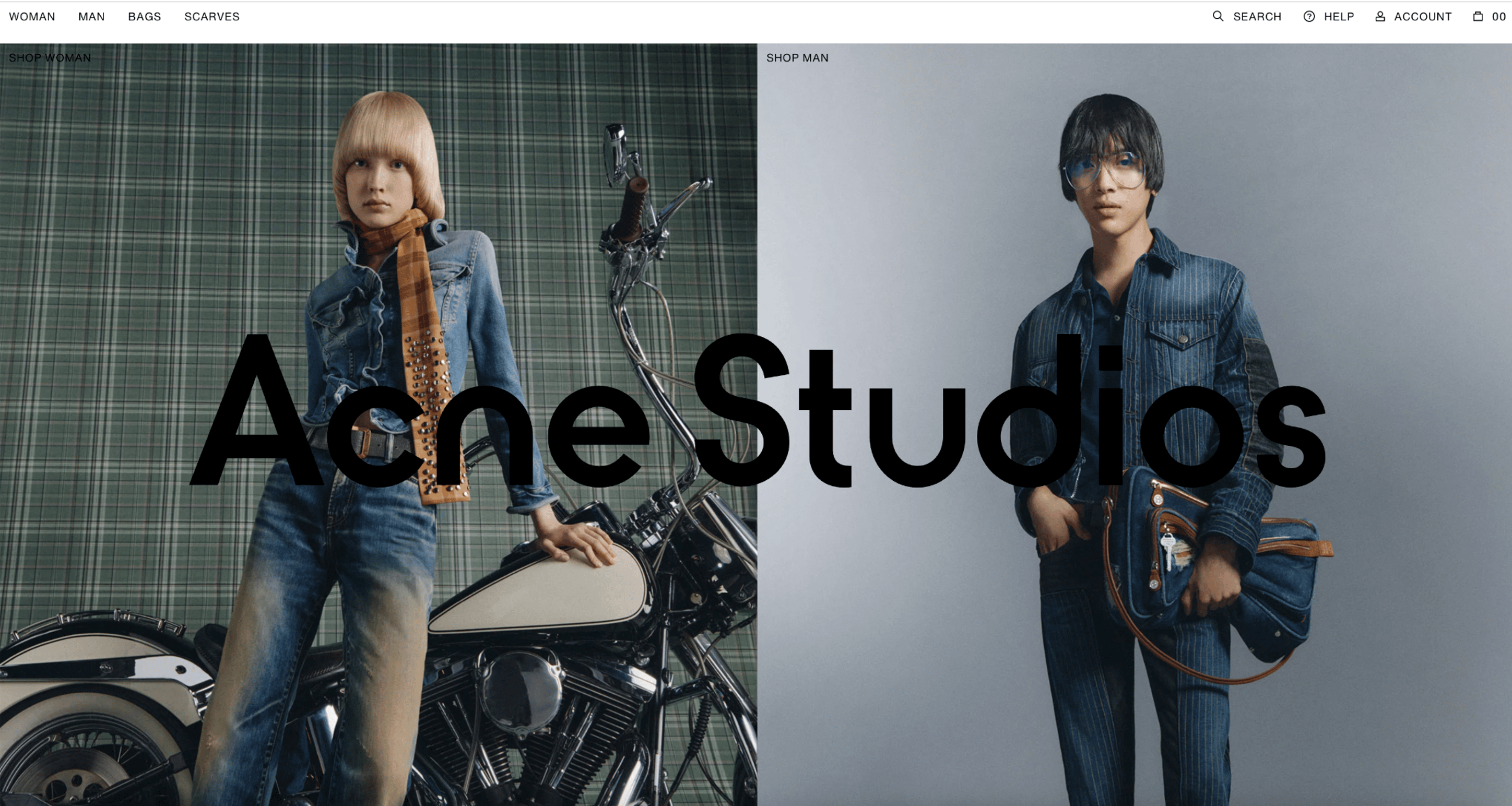 Acne Studios' March 2026 homepage features typical desaturated, cool-tone, editorial photography.
For Instagram, Acne Studios used Michael McGregor’s hand-drawn illustrations to introduce something its usual imagery rarely conveys: warmth, messiness, and a touch of imperfection. The drawings feel more intimate and human than the brand’s standard visual language.
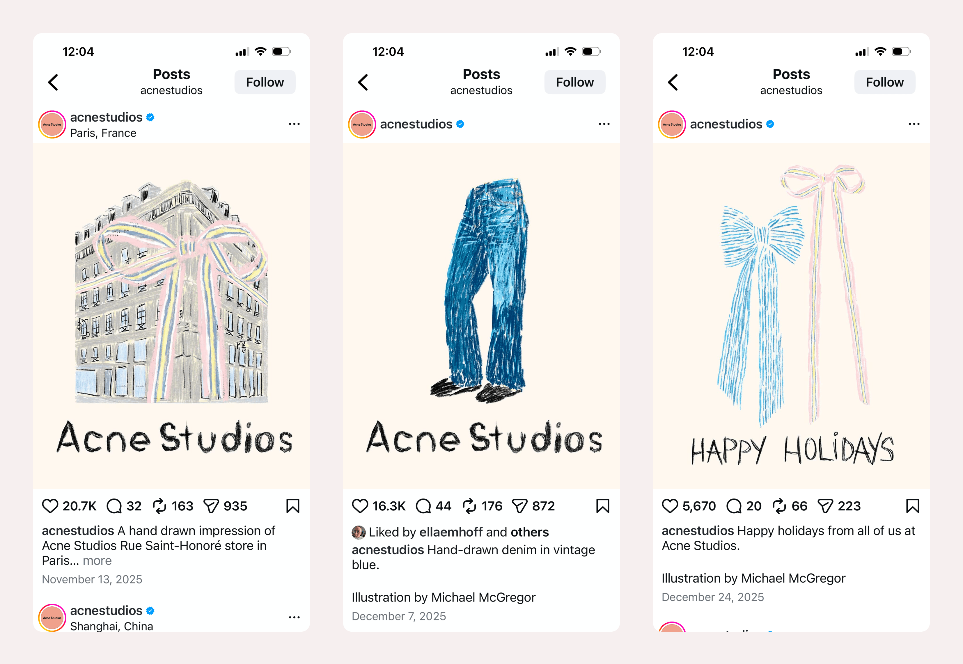 Acne Studios Illustrations by Michael McGregor for Acne Studios' 2025 Instagram campaign
Importantly, Acne Studios didn’t completely change its identity. McGregor's illustrations exist alongside the brand’s classic materials rather than replacing them. If even a brand defined by cool minimalism can use drawings to add a little warmth and humanity, it means that everybody can, and that participating in this trend does not require a full rebrand.
Handmade Has Become a Trust SignalThe handmade aesthetic has become a trust signal, prompting all sorts of companies to incorporate it into their branding. Many AI and robotics companies have adopted warm colors, illustrations, and hand-drawn elements because those signals read as trustworthy and human. It's a way of adding warmth to products that otherwise appear impersonal or threatening. If the interface feels approachable, people are more likely to try it.
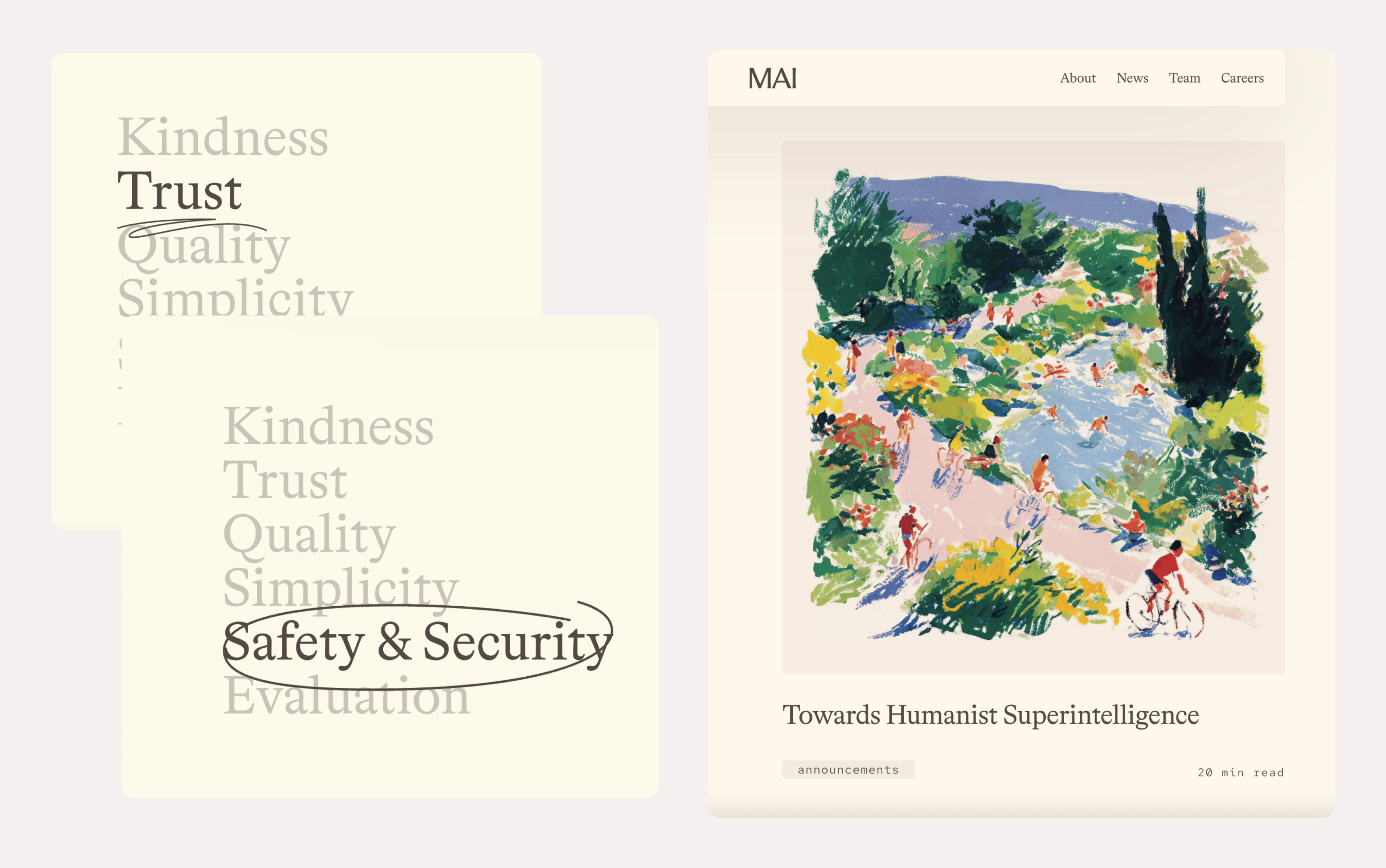 Microsoft AI’s website uses hand-drawn visuals and gouache-style illustrations.
If a brand communicates trustworthiness and fulfills its promises, that’s great. The issue is when the visual messaging promises qualities that the product cannot back up. When the brand feels welcoming and secure, but the associated tool fails standards of security or accuracy, users will feel misled. Warmth that conceals the true attributes of a product undermines trust.
What This Means for UX DesignTrends are worth paying attention to because they’re signals. They tell us what users are responding to emotionally right now. Here are a few guidelines for deciding whether and how to use this trend:
You don't have to fully commit all at once. Try it in one campaign, one new feature, or even a social media post, like Acne Studios did. If it resonates, expand from there. Voice is part of the aesthetic too. UX writing that sounds like a real person gives the same impression as handmade visuals. Pair handmade visuals with human-sounding copy. Be authentic. Audiences are good at sensing whether a design genuinely reflects the product. The brands that get this right express something they already have, not using warmth as a cover. Before committing, ask whether the signal fits your context – your product, your users, your team's ability to pull it off authentically. Consider the 3 B’s and test your ideas with real users. Trends go out of style, but if the handmade aesthetic is authentic to your product, it will keep working.
Comments (0)