
Remember me
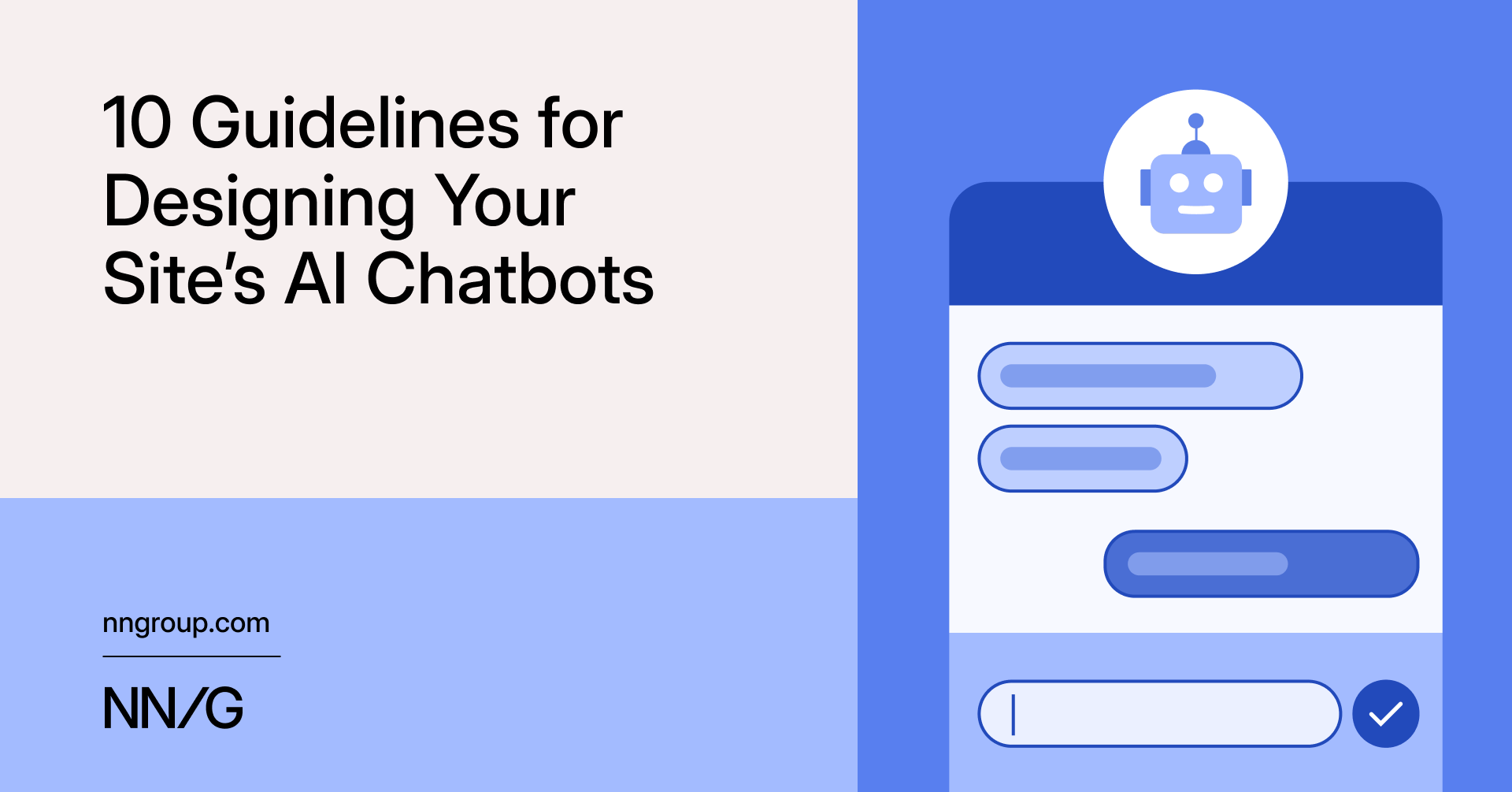


Summary: Helpful site-specific AI chatbots clearly state their capabilities, offer relevant prompt suggestions, and quickly signal they know what users are looking at.
AI chatbots are increasingly becoming a standard feature on many websites. As more sites adopt them, the question is not only whether to have one — it's how to design one so that people find it helpful and keep coming back to it.
We studied real users interacting with AI chatbots across multiple sites and found that small design decisions had a large impact on whether people relied on chatbots for help. How the chatbot introduces itself, whether it follows users across pages, and how it presents product recommendations all shaped whether participants walked away satisfied or frustrated.
In this article, we share 10 practical design guidelines for building chatbots that work.
It can be tempting to add a third-party AI-chat feature to your site as another way for users to find what they need. However, an AI chatbot in addition to existing chat channels can cause confusion.
New AI Features Mean New Usability GuidelinesHome Depot's website had two chat options: Magic Apron, an AI product assistant, and Live Chat, an AI-powered virtual assistant that handled customer service and could escalate questions to a human agent. These could be accessed from different places: Magic Apron hovered in the bottom-right corner of the page, while Live Chat was displayed as a banner on the right. Their names do not clarify the distinction either.
To make matters worse, Live Chat was available on all pages, while Magic Apron disappeared once the user began the checkout process.
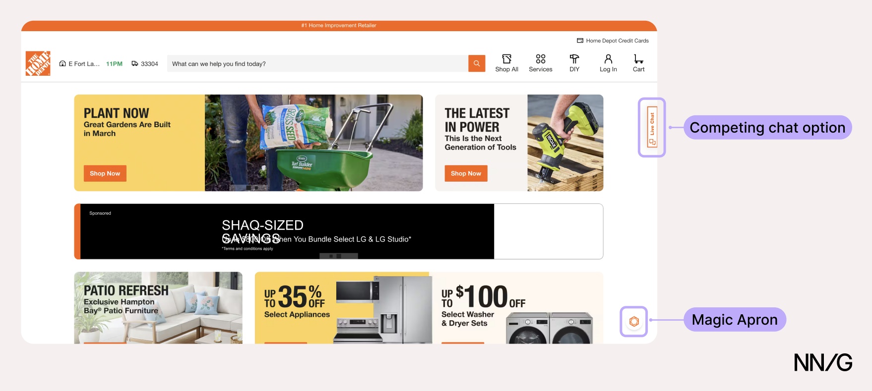 ❌ Home Depot had two chatbots, and it’s not clear what each one was for.
A study participant reviewing his cart had a question about whether a product he was looking at was available at his local store. While Magic Apron could have answered the user’s query, only Live Chat was available on that page, and it provided an irrelevant answer.
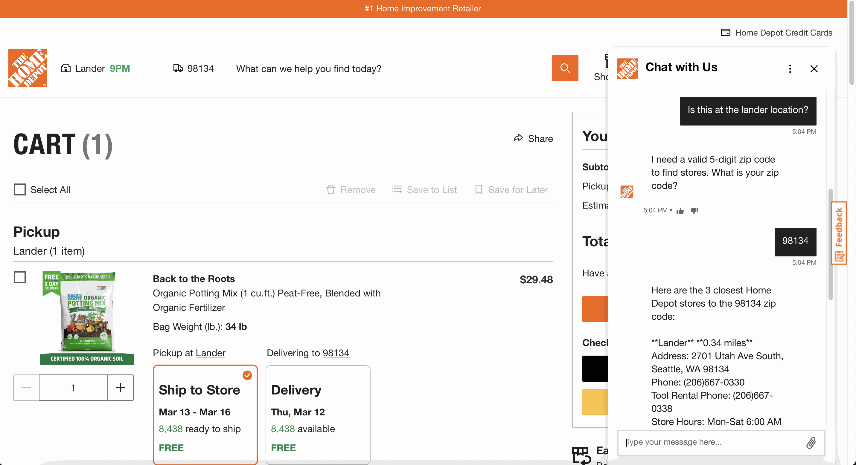 ❌ Home Depot: Only Live Chat was available on the checkout page, and it couldn’t answer the user’s question.
 ❌ Home Depot: Magic Apron could have provided a more accurate answer, but it was not available on the checkout page.
Users should not need to understand your internal system architecture to find the help they need.
When adding an AI chatbot to your site, ensure it doesn't compete with other chatbots. Any existing chat options should be consolidated into a single entry point. One chatbot that clearly identifies itself, handles what it can, and escalates questions to humans when it can't is preferable to multiple bots.
2. Keep the Chatbot Accessible Across PagesOnce users find the chatbot, they expect it to follow them as they browse. When a chat helps them find a product or a listing, users will navigate to that page and continue asking questions.
Redfin’s AI-powered search was accessible only via the search bar; once users opened a listing or navigated away, there was no clear way to return to it.
One participant began saving homes that the chatbot showed her. At some point, she navigated away from the chat to review her favorites. When she was done, she wondered how to return to the chat to continue browsing the search results it provided:
“I was hoping I could like spot the little [chatbot] icon somewhere. I didn't see it anywhere to (...) pop back in there (...) Usually, I'll see [it] in the corner somewhere.”
 ❌ Redfin: Once the user opened a listing, there was no clear way to return to the chat.
 ✅ Williams Sonoma’s chat followed the user across pages, allowing them to continue their conversation while browsing options.
If the goal of your chatbot is to support users through a process that spans multiple pages, ensure it's available on every page. A chatbot that disappears between pages is one that users will stop trying to use.
3. Show What the Chatbot Can Do Through Informative Messages and Suggested PromptsWhen users open the chatbot for the first time, the chatbot should clearly and concisely indicate what it can do.
Vague greetings leave users guessing. Turo's chatbot opens with a generic phrase that, in effect, says Ask me anything, setting expectations the bot can't meet — something participants in our study discovered the hard way when they tried to ask it to find vehicles for a trip.
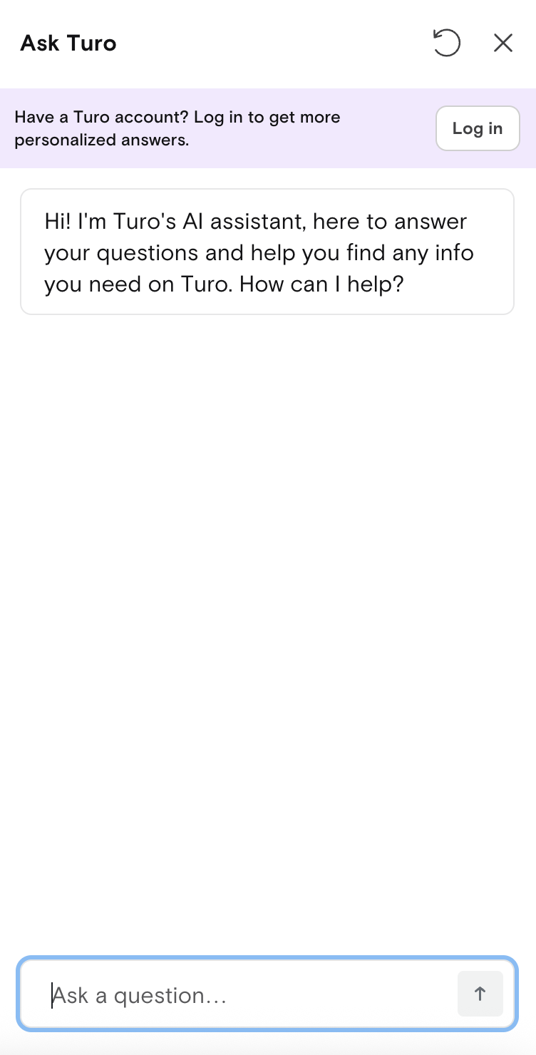 ❌ Turo’s AI chatbot opened with a vague introduction message that shared nothing about what it could or couldn’t do. Worse, it overpromised by saying it can help you find any info you need on Turo.
Indicate the topics or tasks the chatbot can help with in the introductory message. Williams Sonoma's chatbot, AI Sous Chef, listed finding cookware, discovering kitchen essentials, and looking for recipes when users first expanded it. It didn't specify every single capability, but it gave users a clear sense of the territory covered.
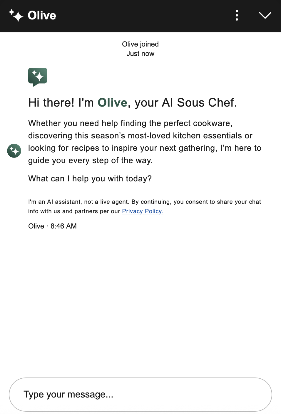 ✅ Williams Sonoma's chatbot listed topics it could help with, giving users a sense of its scope.
The opening message should not overwhelm the user with detailed explanations but rather outline what they can expect.
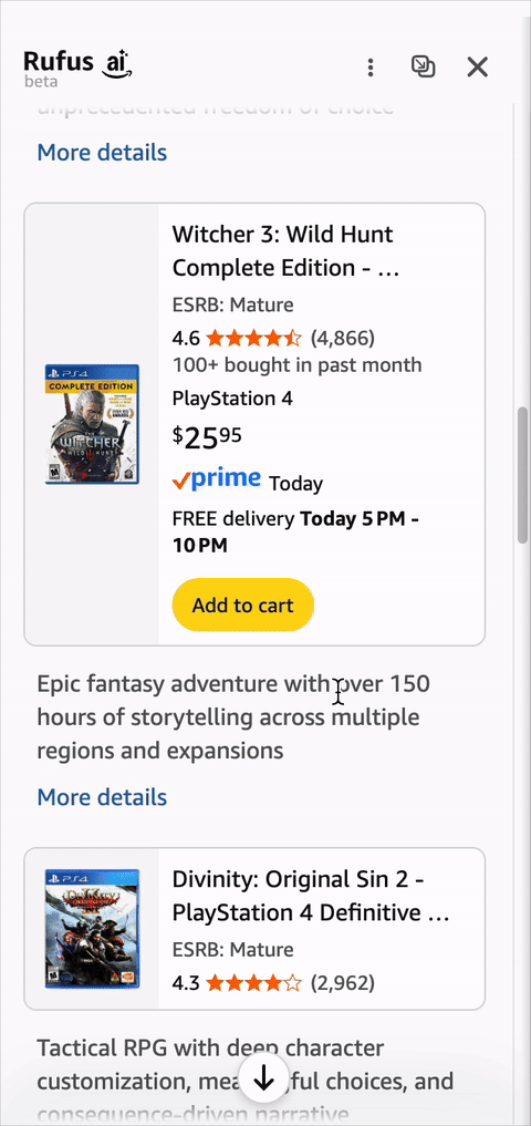
The best approach is to tailor the opening message to the page the user is on. For example, when opening Amazon’s Rufus from the homepage, it showed broad personalized suggestions (Suggest my next read) and exploratory prompts (What deals would I like?). On a product page, Rufus surfaced questions specific to that product — immediately signaling that it knew what the user was looking at.
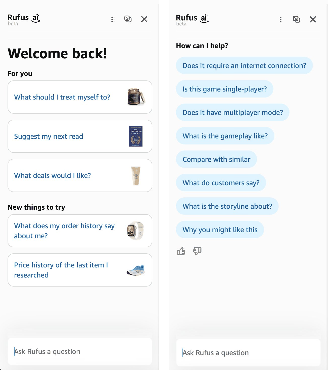 ✅ On the homepage (left), Amazon's Rufus opened with broad, personalized suggestions suited to someone in the exploration phase. On a product page (right), Rufus updated its suggestions to reflect the specific product.
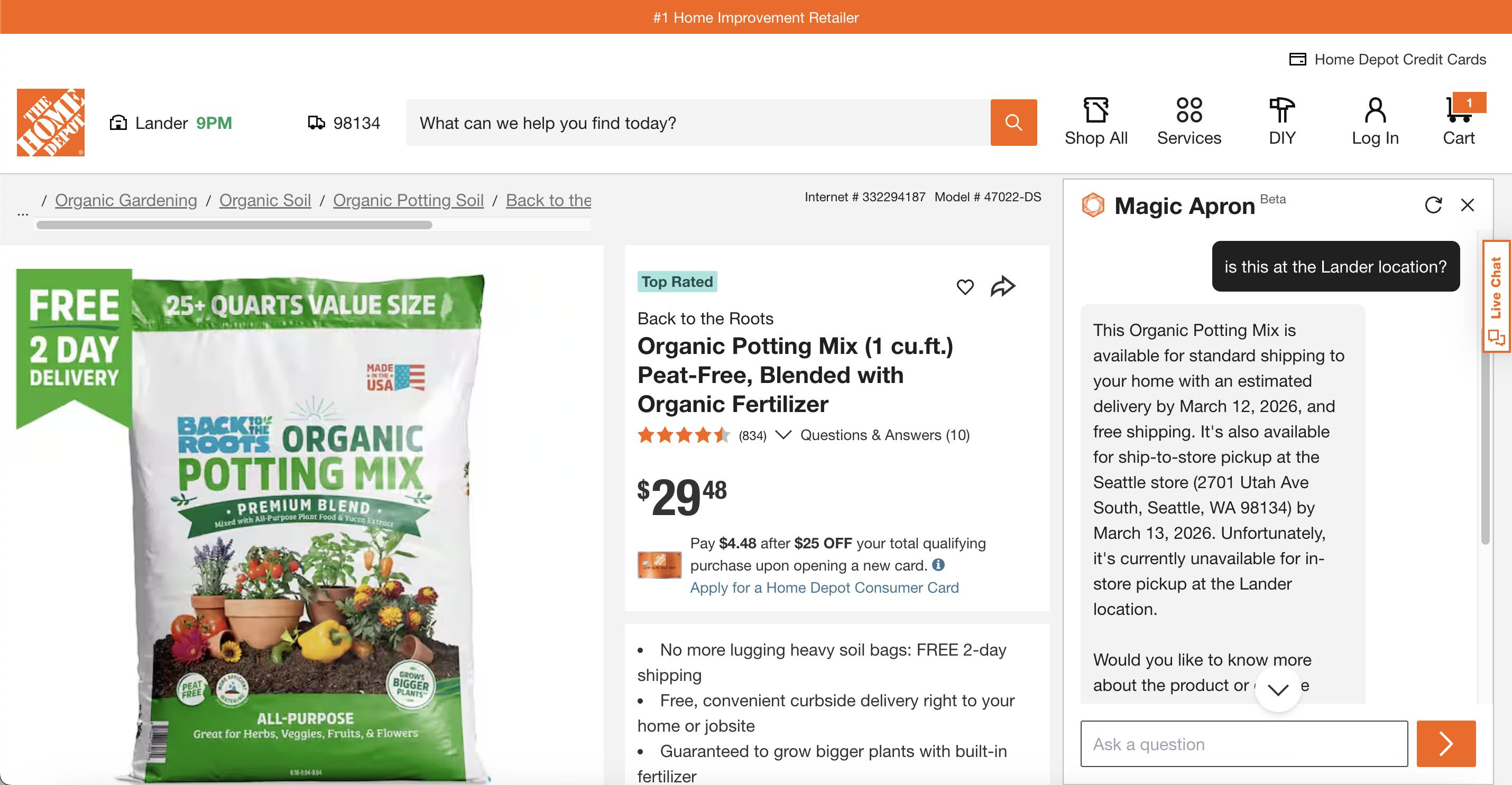
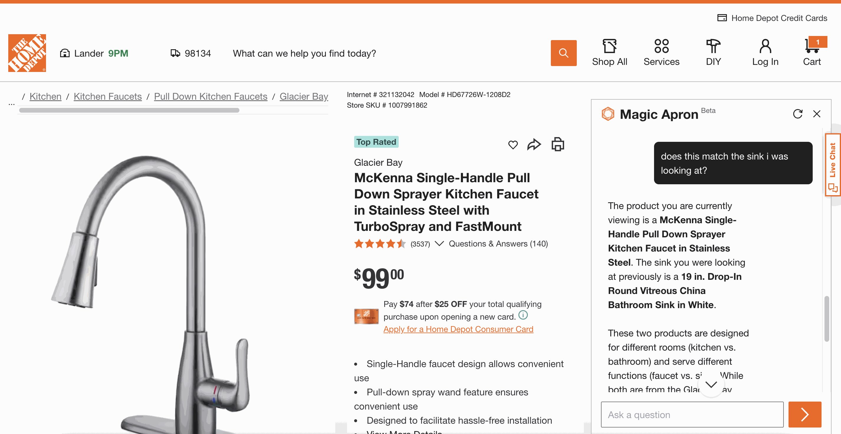
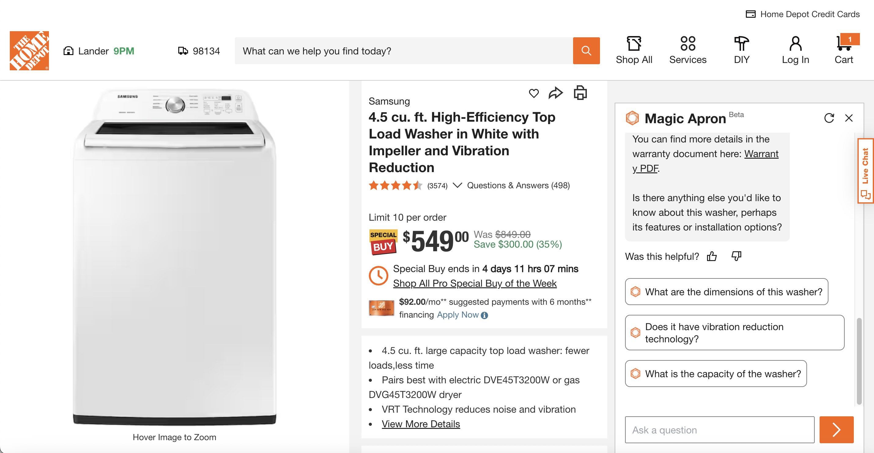
Users won't assume a chatbot knows what they're looking at unless the chatbot makes it explicit to them. Home Depot's Magic Apron can answer product-specific questions, but its interface gives no indication of this capability. One participant assumed the bot couldn't see the product he was viewing and manually copied and pasted product names into the chat.
“Does this know that I'm on this page? I don't think it does. I feel like it's living in its own sidebar and doesn't know what I'm looking at.”
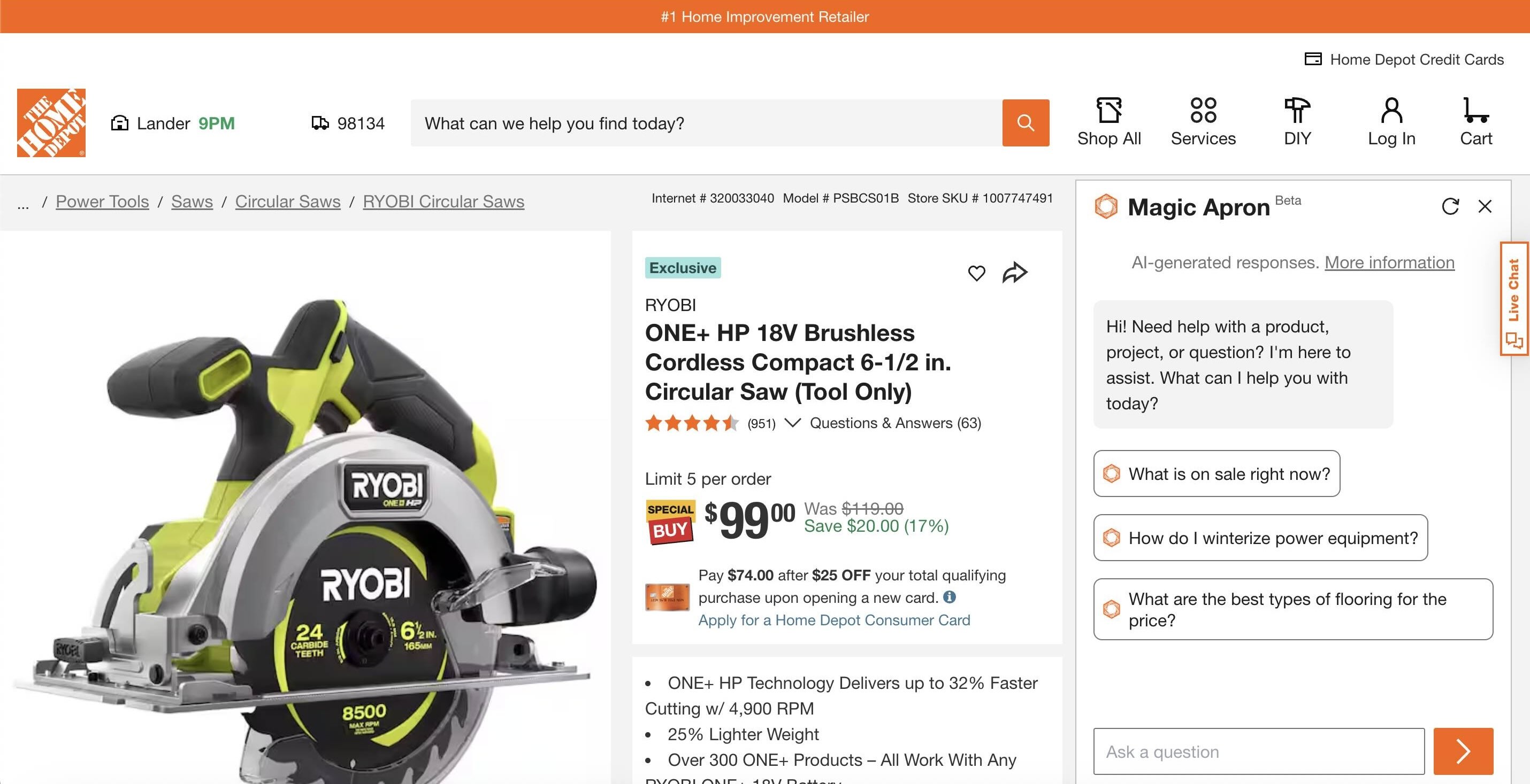 ❌ Home Depot’s AI chatbot did not indicate that it’s page-aware and capable of answering questions about the product.
Magic Apron capabilities went even further — it could remember products the user had browsed earlier in the session, not just what they were currently viewing. One participant navigated to a kitchen faucet page and asked the bot whether it was compatible with the bathroom sink he had seen before. The bot recalled the correct sink and told him they weren't a match — but nothing in the interface had suggested it could do this.
 ❌ Home Depot’s chatbot did not communicate its ability to remember browsing history and details from earlier in the conversation.
Surfacing this capability through suggested questions — like Does this faucet match the Round Vitreous China Bathroom Sink? — would have shown the user what the bot was capable of and made his shopping experience easier.
If your chatbot knows what the user is looking at or can remember what they've browsed, inform them about those capabilities. Update suggested questions or reference the product they’re currently viewing. Users can take advantage only of features they are aware of.
There are two places where chatbots can show suggested prompts:
When the users click on the chatbot for the first time After the chatbot provides an answer — and when there’s more the user could uncover about the topicProviding suggested prompts reduces user effort by removing the burden of formulating questions. To make it easier for users to choose a suggested prompt, present them as clickable buttons, rather than text. This approach avoids unnecessary typing and supports offering multiple suggested prompts without creating a wall of text.
In the opening message, suggested questions can compensate for a more generic greeting. For example, both Home Depot’s Magic Apron and Scouting America’s Scoutly showed users some possible questions from the beginning and let them start the conversation by simply clicking a button.
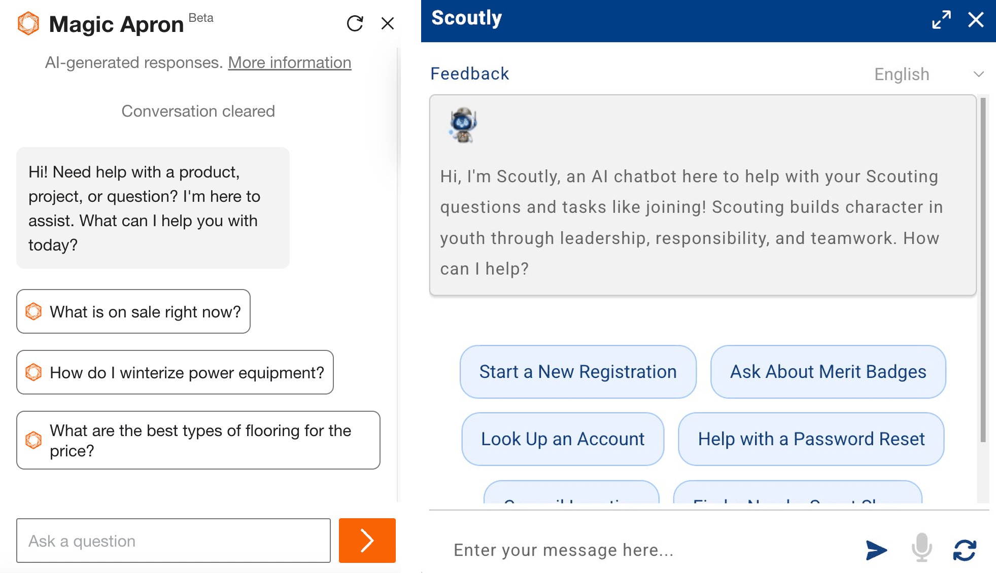 ✅ Both Home Depot’s Magic Apron and Scouting America’s Scoutly featured clickable, suggested questions that effectively communicated what the chatbot can do.
Unfortunately, Scoutly stopped providing clickable suggested questions once the conversation began, leaving users without guidance on what they can ask next. One participant noted the absence of the suggested questions as they started chatting:
“[I]t doesn't have the option for secondary questions, which I feel like is a very helpful thing [...] It could prompt you with questions or essentially other options to further your thought process.”
 ❌ Scouting America’s Scoutly stopped providing clickable suggested followup questions once the conversation started, leaving the user without guidance on what to ask next.
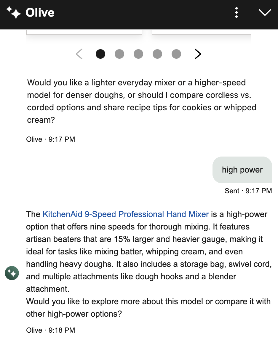
In contrast, Williams Sonoma’s AI Chatbot AI Sous Chef continued to offer followup questions throughout the conversation. One participant looking for a dough mixer appreciated how the chatbot surfaced considerations she wouldn’t have thought about herself:
“Again, I really like their followup questions (...) I probably wouldn't have thought [of them] before. Okay. Oh, I want lighter, I want high power. I like how they suggest that for me.”
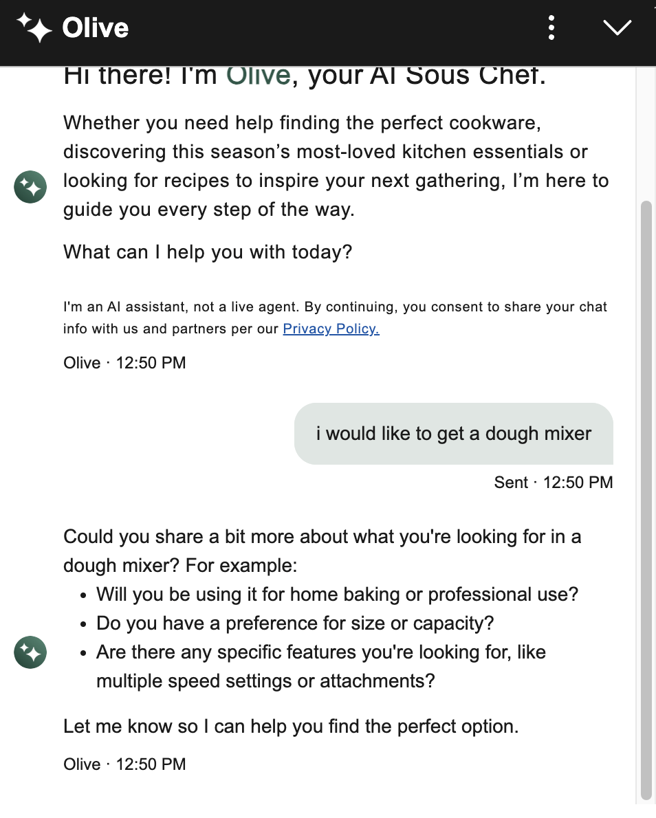 ✅ Williams Sonoma's chatbot asks relevant followup questions to help the user refine their needs, surfacing dimensions they might not have considered on their own.
Unfortunately, Williams Sonoma’s followup questions were text, so if users wanted to use them or answer them, they had to type them. On the other hand, Home Depot’s AI chatbot provided clickable suggested questions after each response, facilitating easy selection.
 ✅ Home Depot's Magic Apron offered clickable suggested questions that updated based on the conversation context, giving users a clear path forward.
However, followup questions can feel annoying when irrelevant or repetitive. One participant using Redfin's AI search grew frustrated when it kept asking about features — like a big backyard or a specific kitchen style — that she had deliberately left out. She also complained that the questions were inserted in the answer text, and she’d have to type them:
“I haven't given the mention of specific features like a large backyard or a specific kitchen style, although it's been asking about it for the last (...) two followup questions. But I think if I see it again, I'll be annoyed (...) Rather, instead of (...) [making] me type (...) [I’d prefer] (...) multiple-choice options (...) I think that would make my job easy.”
When a user refuses to engage with a followup question, repeatedly suggesting it can make the bot feel pushy and inattentive. Followups should respond to where the user is in the conversation, not revisit what they've already passed on. Additionally, presenting them as clickable buttons makes it effortless to continue the conversation.
5. Include Images, Not Just Links or Text DescriptionsRecommendations are more useful when they include images, not just product names or descriptions.
For example, participants in our study liked it when chatbots displayed product visuals. One participant searching for interior paint options was happy to see that Home Depot’s Magic Apron surfaced images of the paints (in addition to links to the product page).
“I love when it gives me some visuals.”
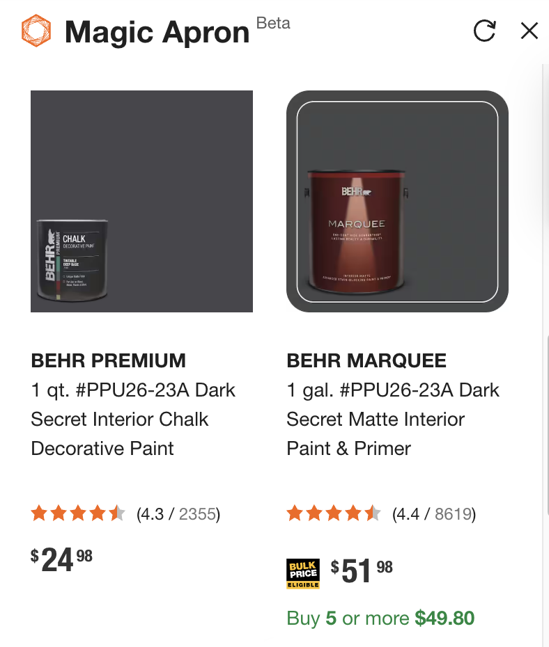 ✅ Home Depot’s chatbot displayed a carousel with product images and direct links, helping users evaluate options without having to leave the conversation.
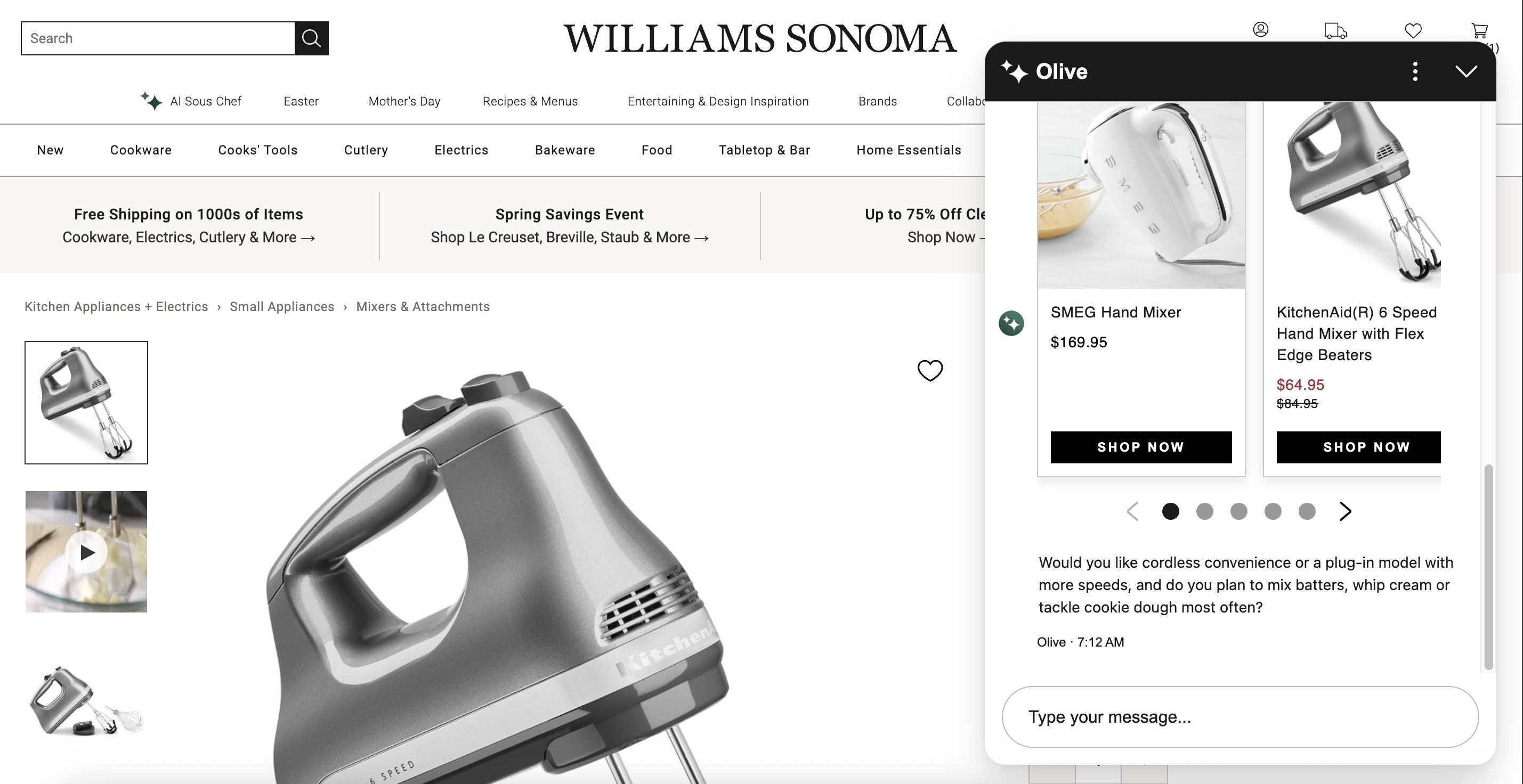
When users weren’t shown an image of a product, they noticed. For example, when one of our participants was shopping for a dough mixer using Williams Sonoma’s chatbot, she received a carousel of products to browse from. The chatbot asked her a series of followup questions — such as if she was looking for a lighter or more powerful mixer. She replied, “high power,” and was provided with a single product recommendation that didn’t include an image, but just a name and a link. On receiving the recommendation, the participant said:
“I would have liked the option of seeing a picture, too.”
 ❌ Williams Sonoma’s chatbot failed to provide an image of the product it recommended, requiring the user to click through to see it.
Imagery is helpful not only when browsing products. Any bot that provides step-by-step instructions should include visuals in its answers.
One participant asked Magic Apron how to install a bathroom sink and received a detailed text response that referenced tools and components he wasn't familiar with, such as a P-trap. When he asked what it looked like, the bot could only describe it in words. As he read the description and tried to imagine what the component looked like, he remarked:
“At a certain point, I need to see a picture of that.”
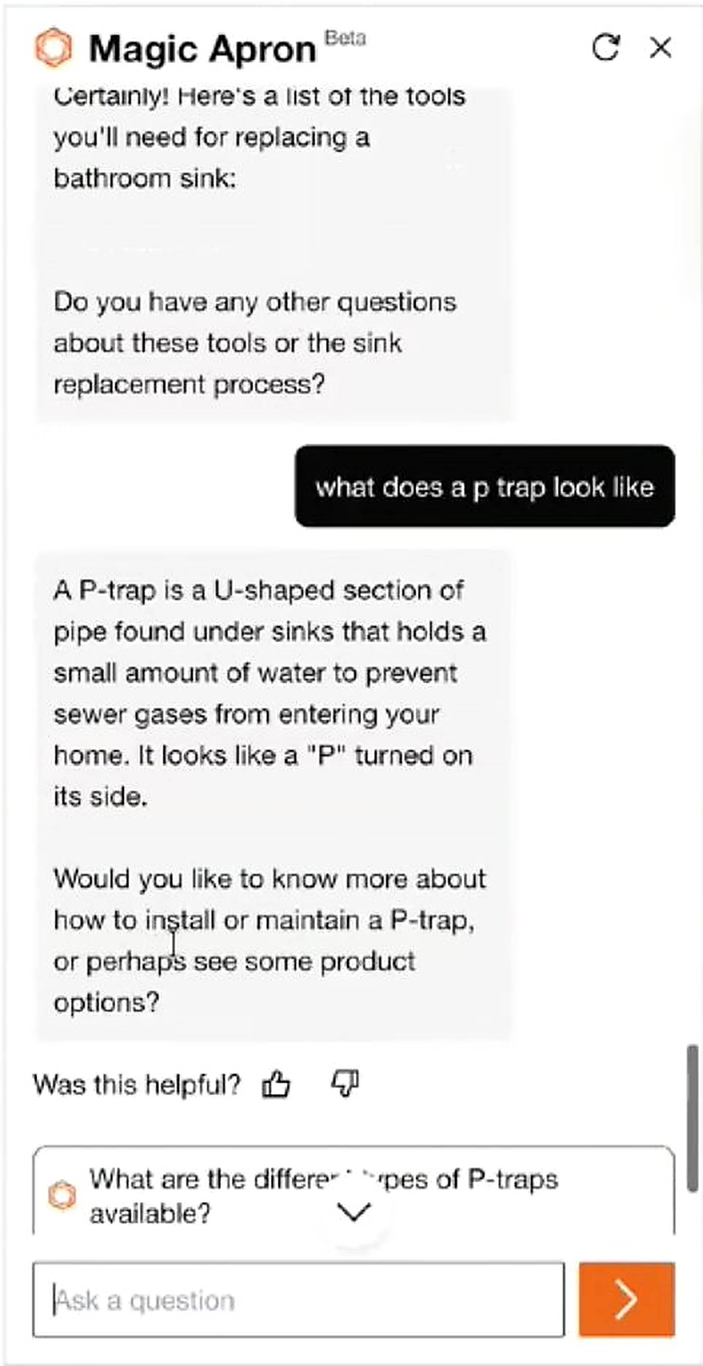 ❌ Home Depot’s Magic Apron didn’t provide images when describing parts, something users would have found helpful.
If your chatbot helps users find or compare products or learn how to do something, include images in the responses where relevant. Text-only recommendations force them to do extra work to evaluate their options.
6. Use Progressive Disclosure to Keep the Chat ShortAI chat conversations can get long quickly, especially on ecommerce sites, where users are exploring and comparing multiple products. To prevent this issue, use progressive disclosure: let users expand and collapse additional product information in the chat.
Unfortunately, we didn’t see many bots utilize this strategy, but we think they should.
When one participant used Amazon’s chatbot, Rufus, he noticed a More details link beneath each product. He thought the link was an accordion and that, when clicked, the details would be shown below it. However, clicking it generated a new chat message.
 ❌ Rufus displayed a More details link beneath each product; clicking it generated a new chat response at the bottom, pushing the product list out of view.
The new response appeared at the end of the conversation, pushing the product list further up and out of view. This not only led users to lose context and sight of the other options they were comparing, but also made the chat longer. Like one participant pointed out, a better design would have expanded the details in place and given users the ability to collapse them back.
“I expected to (...) click on it, and it would expand the page right below it. But instead, it seemed to, like, ask it another question about that product [...] It would be nice if (...) it shows you the details, and then you say okay, cool, get rid of that, and just like collapse it. Because it would help keep my chat shorter. Because that's one thing I've noticed when doing the AI chats is they can get extremely long.”
Some chatbots autoscroll users at the end of lengthy responses, forcing users to then scroll back up to read from the beginning. This behavior is particularly overwhelming and disorienting when a chatbot streams its response (i.e., it displays its answer incrementally as it is generated), since the users may have already started reading, and then they have to refind their spot in the answer text. We observed this behavior across multiple bots in our study.
For example, the Mississippi Government’s AI chatbot, MISSI, streamed long responses and would autoscroll users to the end of the response, making it impossible for users to read anything until it had stopped. Moreover, users needed to scroll back up to begin reading.
 ❌ The Mississippi State Government’s AI chatbot autoscrolled users to the bottom of a message while it streamed its response. Users had to scroll back up to read the response.
Turo, a peer-to-peer car rental company, had a chatbot that behaved similarly. When a participant asked whether he could use his personal car insurance to cover a Turo rental, he received an answer, which he started reading aloud. However, the response was long, and he couldn’t read it fast enough as it moved up the chat dialog. He stopped reading and said, “[I’ll] wait for it to finish.”
If a response is longer than the chat viewport, keep the user's scroll position at the top of the new message rather than jumping to the bottom. Users expect to read from the beginning, not work backwards.
8. Allow Users to Resize the Chat WindowAllow users to resize or maximize the chat window, especially if the content can benefit from more visual space.
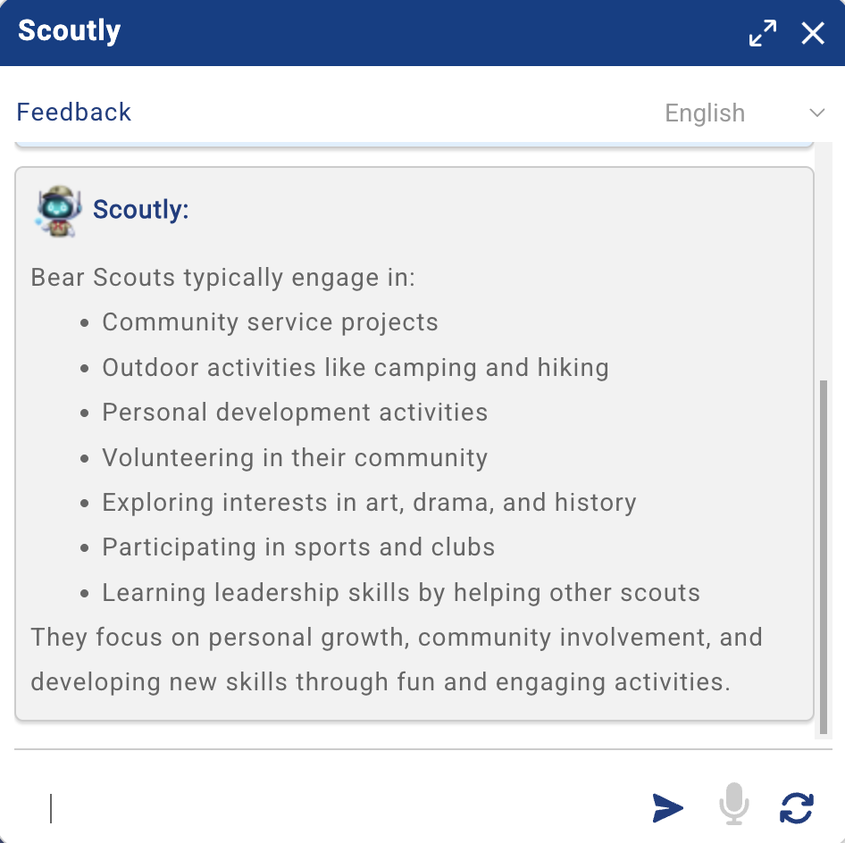
Most chatbot windows are quite small by default, which is appropriate for quick questions but can become limiting when the answers offer detailed or visual content. One participant interacting with Scouting America’s Scoutly was presented with an interactive map. The participant appreciated the map and expanded the chat dialog to see it better.
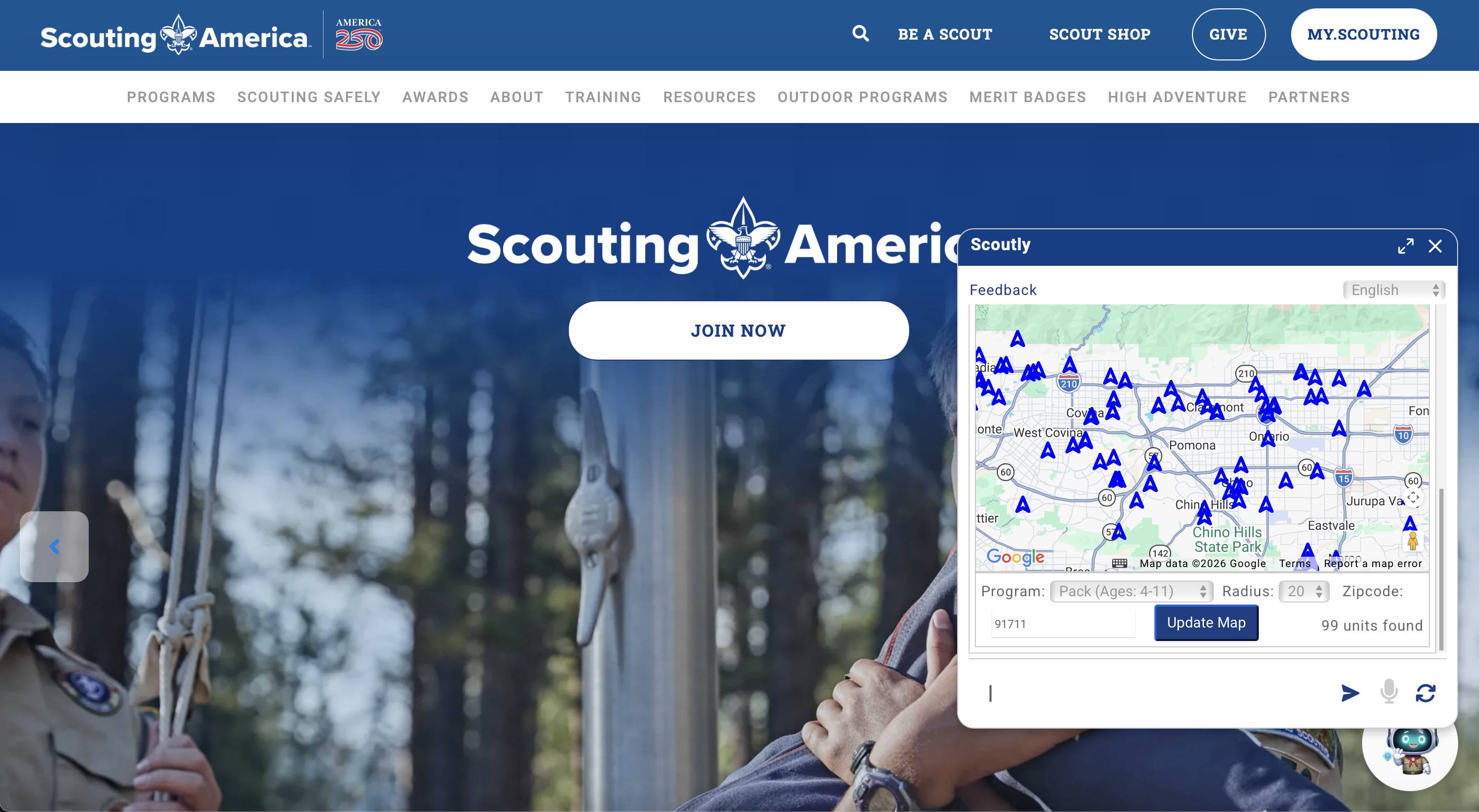 Scouting America’s Scoutly displayed an interactive map in its default chat window. The small viewport made it difficult to explore the content.
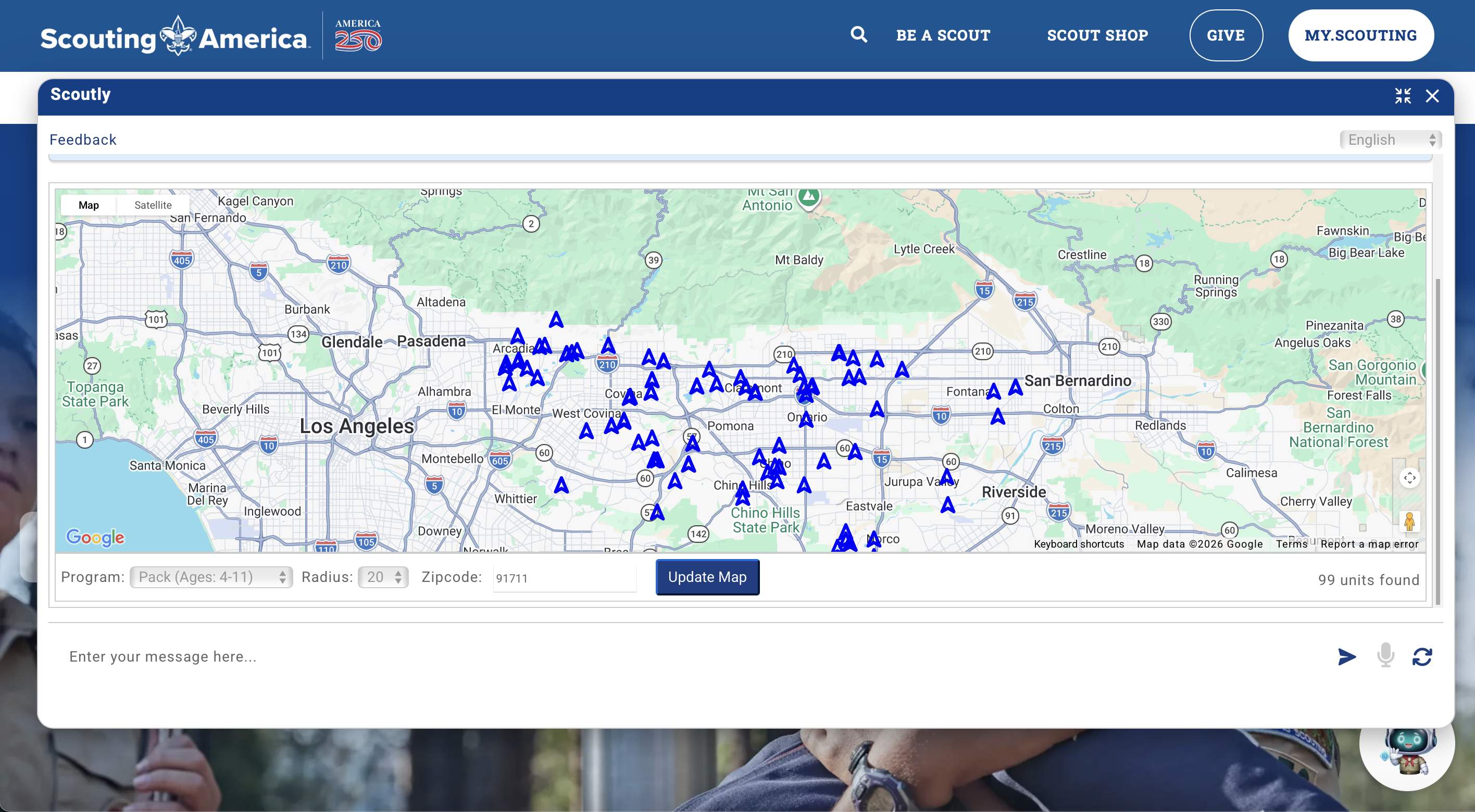 ✅ Scoutly allowed users to resize the chat window and see the map better.
Scoutly was one of the few chatbots in our study that actually allowed resizing; however, other bots that offered rich content – maps, product images and descriptions, and long bulleted lists – could also have benefited from supporting this option.
9. Allow Users to Save or Share Chat ContentChatbots can generate helpful information — like recipes, DIY guides, and product comparisons — that users may want to share or save for future reference. However, most chatbots in our study did not offer the option to save or share the conversation.
One participant looking up sourdough starter tips on Williams Sonoma’s AI chatbot received a detailed set of instructions that she wanted to save or share with her daughter; however, the chat did not offer a way to do so.
“I would definitely want to like email it to myself, or I would want to be able to share it for sure to my daughter, who's also kind of doing sourdough right now.”
She identified multiple ways the chatbot could’ve met her needs – favoriting, emailing, and sharing through social media. When the chat generates content that users may want to reference later, it should provide a way for them to save, download, or share it. A useful conversation that disappears after the user exits the page is lost value.
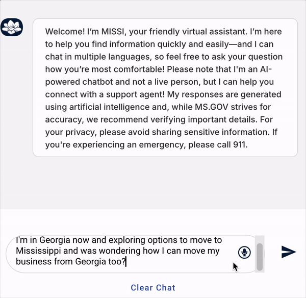
10. Consider Offering Voice InputNot every user wants to type their prompts. One participant was explicit about her lack of willingness to continue her conversation with Redfin’s AI because it required her to continue typing instead of providing a voice-input alternative:
“I might be texting [sic: typing] in this for five minutes, but after three minutes, I would have actually shut this page off because it's very frustrating to keep texting. (...) The first thing I would really suggest is: please, please have a voice-to-text option. It's going to help me a lot, and it's going to help me stay in [sic] this page.”
For this participant, the lack of voice input was a dealbreaker. Without it, she would’ve left the chat if she were interacting with it on her own. While she was the only participant who explicitly raised this issue, voice-to-text is also an accessibility consideration. For users with motor impairments or situational limitations, typing may not just be inconvenient, but altogether impossible.
ConclusionThe difference between a chatbot that users rely on and one they abandon often comes down to small design decisions — how it introduces itself, whether it follows users across pages, and whether it surfaces what it can do. These details may seem minor, but they shape whether users discover what the chatbot is capable of, find it genuinely helpful, and keep coming back to it.
Comments (0)